Monday, October 31, 2011

Breakfast Table Reading Material

Orange is a good color for today. Not only is it a color associated with Halloween, it's also the color of a box of Wheaties. And Wheaties boxes have been associated with sports figures for generations.

Wheaties placed baseball stars on its boxes as early as 1935, such as this one:


This is a Series 1 type of the brothers Dean. Measuring 6 inches by 6 1/4 inches with the frame, there were 26 different pictures used in this series, including two of "Jack Armstrong, All-American Boy." He was a fictional character. This picture of Dizzy and Daffy Dean was the only one that featured two players.

Eventually, Wheaties realized that kids might learn something while the cereal box was sitting on the breakfast table:


This is from Series 5, which appeared in 1936. The various subjects explained how to play their positions, giving helpful suggestions. There were 12 players featured, although some had variations. This is a complete back panel from a box, measuring 8 1/2 inches high by 6 1/2 inches across.

The "tips" continued through another series in 1937. Eventually, it became focused on the player and color was added:


This back panel comes from Series 10, which arrived in 1938. There were 16 players in this series, which included a single player from each major league club.

There were 14 different series of Wheaties box panels from 1935-'39, with a series called "Champs of the U.S.A" that appeared in 1940 and '41. While baseball players made up a bunch of the series, they weren't alone. In fact, Series 2 was completely devoid of baseball players.

But featuring sports figures on Wheaties boxes isn't a recent development at all.

Friday, October 28, 2011

Q&A -- A Glossy Clemente Card

Today's question comes from Stephen:

Q:


"I have a Bob Clemente Baseball Card that looks a lot like a Topps 1965 Card, but on the back it states that it is a Dover reprint. 


I have the following questions:

1) What can you tell me about?

2) When could this card have been reprinted?

3) Value of this card?"
 
A:


Your card was included in a book called Hall of Fame Baseball Cards by Bert Randolph Sugar. It came out around 1983 and was essentially a collection of reprinted baseball cards going back to the 1800s. The cards were glossier than the originals, perforated and each one clearly stated "A Dover Reprint" on the back to differentiate them from authentic cards.


It's the book on the right in the above picture. I own the other one. Here's a random card from that edition:


It looks like a 1915 Cracker Jack card of "Shoeless" Joe Jackson, but it's very glossy and actually printed on thicker, sturdier cardboard stock than the original was. Here's the back of the card:

And right along the bottom, you can see the words "A Dover Reprint." Dover was the name of the publishing company Sugar used for these books.

Sugar authored a number of these books in the late 1970s and early 80s. They are fairly easy to locate in complete form, including this one on Amazon that is $5.99 new or as little as 99 cents used:


As for the final part of your question...since it would cost six dollars to get the complete book with your Clemente card still attached, the value of your card is worth much less.

Wednesday, October 26, 2011

Latter-Day Tobacco Cards

Most hobby guides will tell you that tobacco cards stopped appearing in the mid 1910s. That's not entirely true.

I picked up this card a little while ago:


It's a 1954 Red Man card. They were inserted into packages of Red Man chewing tobacco, along with a tab at the bottom that could be cut off and redeemed fora baseball cap. The offer was spelled out on the back of the card:


Red Man cards appeared between 1952 and '55. Each year had a set of 50, with 25 All-Star players from each league. Cards are found either with the tab or without, and the tabs make a big difference in the value of the card.

Monday, October 24, 2011

"Round" Cards

Last week, Greg over at Night Owl Cards showed off some pogs that were inserted into packs of cards during the 1990s. Pogs were a fad at that time, but were a rehash of an old-time concept: the paper toppers used to "cap" off the tops of milk bottles back when local dairies made home deliveries. Greg lives in the same part of northern New York where I grew up and I can tell you that the area is a big dairy producer, so there was a lot of reminiscing by the "old-timers" in the 1990s about how pogs weren't really new items at all.

I really don't know of any baseball-related pogs from the 1950s, but I really wouldn't be surprised to see one surface. However, there was an even earlier set of cards that mimicked their design:

(Not mine...This image and the one below were grabbed from this Web page)

This is a Colgan's card and dates from 1909-'11. The set has been catalogued as E254 and was included one at a time in five-cent tins of Colgan's Violet Chips or Colgan's Mint Chips, which were a gum product at that time. The back advertised the product:


The cards are the size of a silver dollar, one and a half inches in diameter.

There are also two other series of Colgan's that are designated as E270. One is red-bordered and the other is called "Tin Tops" because of the wording of the back advertisement. Both of those sets date to 1912 and 1913.

A Robert Edward auction a few years ago had this neat store display, complete with Honus Wagner's card and a couple of Colgan's Mint Chip tins:


Also, an advertisement for Colgan's Chips was incorporated into the cover of Lew Lipset's The Encyclopedia of Baseball Cards Vol. 2: Early Gum and Candy Cards. Here's the cover of my own copy of the book:


To tie this all together, I was talking with another collector who has a nice collection of these cards. He told me that he once explained to another advanced collector that his focus was E254/E270 and was greeted with a disapproving reply: "Those aren't cards. They're pogs."

Say what you want about them, I like them.

Friday, October 21, 2011

2012 SCD Price Guide is Now Ready

The 2012 edition of the SCD "Big Book" is now being sent out to collectors. I mentioned the guide in this blog back in July, when it was still available only as a pre-order item.

I also mentioned that the 2012 edition would be a vintage-only guide that cut off at 1980. This was cheered by vintage collectors but jeered as being "incomplete" by others. I have sympathy for both sides, and personally felt that either a two-volume set or a CD-ROM that would allow the info to easily be loaded onto a computer would have been a better idea.

One more thing: with this edition, long-time editor Bob Lemke has retired. While it'll be weird not to see his name on the cover (he was doing the job when I was a kid and first paid attention to the fact that people were actually writing about the hobby), I'm happy to see that Bob has reached the point in his life where he can just focus on himself. SCD doesn't seem to be in a big hurry replacing him (note to SCD -- I'm available and will consider relocating), so I'm not sure what a 2013 edition will contain.

If you'd like to pick up a copy, Amazon has new copies available cheap:


One thing that has been included is a Hot/Cold list. Here's what SCD has to say about the current state of the Hobby:

HOT
  • Ruth
  • Cobb
  • Gehrig
  • Koufax
  • Clemente
  • Ryan
  • Rare T-card backs
  • T205, T206
  • M101-4, M101-5
  • 1920s Exhibits
  • Bowman
  • 1952 Topps
  • 50s-60s regional issues
  • NM+ cards

NOT
  • Joe Jackson
  • Wagner
  • Young
  • Mantle
  • Aaron
  • Rose
  • E-cards
  • T202, T207
  • 1910-11 Sporting Life
  • 1930s Goudey
  • Leaf
  • non-1952 Topps
  • Latin American issues
  • Collector-grade cards

 I think this is an interesting list. I definitely agree about rare T-card backs simply from my experience working at The National this year, but don't see prices softening on vintage Mantle or Aaron cards. If anybody has anything to say about the list -- good or bad -- feel free to say so in the comment section.

Wednesday, October 19, 2011

The Fall Classic...and a Hobby Classic

Today is the start of the World Series. Rather than running a repeat entry, I'll link to the four-part series from last year:

World Series Cards Through 1969
Postseason Series - the 70s Part 1
Postseason Series - the 70s Part 2
Postseason Series - the 70s Part 3

Instead, I'll show off this card from a Series that took place in my youth:

1978 Topps #413 -- the '77 World Series card

When I was a kid, this was the very first baseball card I owned. Up to that point, I owned a number of non-sports cards (most notably Star Wars), but it wasn't until this was traded to me for one of those non-sports cards that I even paid attention to baseball cards.

Say what you want about the Yankees now, but at that time the team was just coming out of a 15-year slump and that man getting ready to take a big swing was one of the missing pieces needed to make that happen. Not only that, but he had his own candy bar. That may have also attracted my attention at six years old.

Monday, October 17, 2011

The Hockey Season is Underway...A Glimpse From 50 Years Ago

With the NHL hockey season now underway, here's a look at a Topps set from exactly 50 years ago.

The 1961-'62 Topps hockey set was designed with the game of hockey in mind. Here's what the front of the card looked like:

Card #55 -- Andy Hebenton, New York Rangers

The player's name, position and team are placed inside a puck icon. This was the first time any hockey-specific equipment was used in the design of a Topps set. The player picture was generally an action shot, which was superimposed over a generic game picture.

The set only featured three of the NHL's six teams, and those three teams were grouped together by number. Cards 1-22 featured Boston Bruins, cards 23-44 had Chicago Blackhawks and the New York Rangers made up cards 45-65. Players from the Red Wings, Maple Leafs and Canadiens would show up on Parkhurst cards that year.
The puck would also find its way to the back of the card:


As you can see from the illustration, the cards were bilingual. There was a single line of stats; up to that time (and for several years afterward), Topps did not use lifetime numbers on its hockey cards.

Each team's first card had the head coach. This was the first time Topps used the coaches in their hockey set. The coaches had a different design:


Card #23 -- Rudy Pilous, Chicago Blackhawks


The design looks like a TV set turned on its side. The same design was used for the rookie players that appeared near the end of each team's series:


Card #62 -- Rod Gilbert, New York Rangers

Topps continued the "TV" design on six "action" cards (two for each team):

Card #64 -- Going, Going, Goal!

This was similar to the Highlights cards from the 1961 Topps football set.

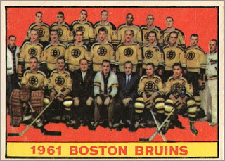
Each team also featured a card that had the assembled team photo:

Card #20 -- Boston Bruins Team Card

Finally, the last card in the set was a checklist card:

Card #66 -- Checklist card

As you can see, each team is clearly set into its own section of the set. Collectors of 1961 Topps baseball will recognize the same design, with the game-action pictures on both sides of the card. This was also the first checklist Topps used in its hockey set.

Friday, October 14, 2011

Old-School "Inserts"

Here's a card I picked up a little while ago:


Before randomly-seeded "chase cards" became the norm, this was the "insert card" of my youth. This card was seeded inside a wax pack of 1983 Topps cards. As you can see, it was a simple "scratch-off" game. Some cards revealed prizes, and others could be saved for a send-away glossy set. The details are written on the back inside a little box:


 Yes, that's a gum stain in the middle. I'd prefer it there instead of a regular card.

I scartched off several of those cards in 1983, but never got anything besides points. However, in 1984, I opened one of the packs sitting inside my Christmas stocking and won a batting glove. Unlike the card above, there was an expiration date of 12/15 on the '84 cards. My mother wrote a short note to Topps asking if they could overlook the little ten-day issue...and Topps sent me a batting glove. I should have kept it, but I wore it out pretty quickly in Little League the following spring.

Wednesday, October 12, 2011

Player's Been Left Out -- 1961 Edition

I've featured cards on this blog before where the original owners used any means at their disposal to "upgrade" their cards to signify a trade. However, sometimes a player isn't featured in a set, so you end up with cards like these two from the 1961 Topps set:


This is card #28 and pictures Hector Lopez. He was a member of the Yankees between 1959 and '66. Since he actually hadn't been traded, I'll assume this card was a duplicate, since the tape names Marshall Bridges. Bridges pitched for the Yankees in 1962 and '63 but never managed to get on a Topps card. As a result, the original owner needed to make one.


This is card #40 and pictures Bob Turley, who was sold to the Angels after the 1962 season. The tape mentions Hal Reniff, who was with the Yankees in 1961 but didn't appear on a Topps card until the following year. I'm also assuming this was a duplicate that was adjusted to get a card for a Yankees team set.

Monday, October 10, 2011

Evolution of a Football Design

For those who complain about how Topps basically recycles its baseball design for its football set later in the year, here's a post that explains it isn't a new concept. While I agree that it is a waste of a creative team to do so, it's merely a way of getting things done so a corporation can focus on making its money.

At the beginning of the post-World War II era, Bowman tried to get into the football card field. Whether its sets were quickly made or if there was only a limited window available, I have no idea.

As you can see from the scan:


Bowman simply used the same front design for its football set that was used in the baseball set earlier in the year.

One thing that was different was the back design:
(Click to see the pictures in a larger size)

Where the 1948 baseball set had only one ink color, two were used in the football set. It's a layout that would appear again in the '49 Bowman baseball set, as illustrated on the third card in the scan.

There was no Bowman football set in 1949, so we'll never know whether they would have used the same design featured in the last series of their baseball set that year (explained in this post from April). However, in 1950, they still went with the same format:


In 1950, both the baseball and football sets featured both horizontal and vertical orientations.I've included one of each type to show the difference.

This time, the backs were nearly identical:


Essentially, the word "Football" has been substituted for "Baseball." There are a couple of minor changes, but they're basically the same back. Without looking at the front picture, it would have been easy to get the two mixed up without a closer look.

In 1951, there was a better definition between the sets:


While the baseball set used a simple black strip with a name inside, the football cards swap the colors and add black lines to the top and bottom, and then place a team logo on the card. In my opinion, this was a very nice improvement. Had they used the logos on the baseball cards, Topps couldn't claim to be "innovators" for putting them on their 1952 cards. In any case, Bowman beat them by several months.

However, the backs were once again similar:


About the only format change involved the name of the sport in red ink.

Friday, October 7, 2011

What is This Thing?

Here's something from the "Oddball" section of my collection:


It's interesting to see players from the past in their uniforms, and on fields that didn't get the meticulous treatment that ground crews give today. "Bullet" Joe Bush played for the New York Yankees between 1922 and 1924, which put him on the team when they first occupied Yankee Stadium.

While it looks like it might be an Exhibit card from the 1920s, it isn't. It's a postcard, as you can see from the back:


And right in the corner is a notification that it's a reprint from 1973.

Here's the interesting part...the address in the center is from Amawalk, New York. The collector in me recognizes the city as the home of Mike Aronstein, the founder of TCMA. Sure enough..."The Card Memorabilia Associates" can be shortened to TCMA. That's a new one for me, as I've heard that the acronym stood for the initials of its two founders.

So, this postcard is part of the process that led to the SSPC sets in 1975-'76 and a slew of collector sets into the 1980s.

I've mentioned Mr. Aronstein in this blog before, as one of the sponsors of the 1984 National:


He's the one sitting bottom left.

Wednesday, October 5, 2011

More "Beaters" For the Binders

So, the other day I was out to dinner with my wife and she sets something on the table...and right on the top is this:


I didn't even get a chance to see his name, but I still said, "Hey! Mickey McDermott!" I've seen that card before, but she seemed impressed to know that I could identify the player by his picture.

Actually, I used to live near Poughkeepsie, New York, which was McDermott's hometown. In 1952, McDermott faced 27 batters in a one-hitter against the Senators. The only batter to get a hit was thrown out trying to stretch it into a double. This 1953 Topps card says nothing about that game; I blame the New York bias. He wrote an autobiography called Something Funny Happened on the Way to Cooperstown just before his death in 2003.

I've mentioned before that my wife will sometimes pick up cards for me. It's a relatively easy process, ever since I placed my online wantlist page into the bookmarks of her phone. With that, she'll know if I need a card without having to call me and ask.

Here's what else came with McDermott:


This is Alex Grammas's rookie card. He would stay in the majors until 1963, usually as a utility or backup infielder. He would go on to a long coaching career, including stints as manager of the Pirates (1969) and Brewers (1976-'77).


1954 was also Stan Jok's first year in the majors. His career wasn't as long as Grammas's however; he was waived early in the season by Philadelphia. The Chicago White Sox claimed him but sparingly used that year and only in six games in '55 before they also let him go. 

A veteran of World War II, Stan Jok died in 1972 at the very young age of 45.


The last card was this Brooklyn Dodger. In the big scheme of things, he's a common player but collectors know there is no such thing as a "common" Dodger in the 1950s. Like the Yankees, the cards get a premium simply because of who they are.

Russ Meyer (not the movie director who favored top-heavy women) was called "The Mad Monk" due to his sometimes volatile temper. When this card was printed, Meyer was in the middle of a very unique accomplishment: between 1953 and '54, he went 24 straight road games without a loss. Only Allie Reynolds has had more.

Another veteran of World War II, Russ Meyer passed away in 1998.

Monday, October 3, 2011

In Celebration of the Hockey Season

Here's a neat set I was just writing about as part of my gig with the Cardboard Connections Website:


This is the only hockey set Topps issued in its larger-size format. The set was released in 1954-'55 and consisted of 60 cards. Due to territorial issues and the presence of another company issuing hockey cards in Canada (Parkhurst), the set contained only players from the four NHL teams them playing their home games in the United States: the Boston Bruins, Chicago Black Hawks, Detroit Red Wings and New York Rangers.

The backs reflect the American origin of the teams:


The backs are printed in red and blue ink on a white card stock. One thing that may seem odd to long-time collectors is the lack of any French translation, unusual for many sets of the pre-O-Pee-Chee era.

After this set, Topps stepped back from the hockey card market for two years, opting instead to watch the market and learn from the competition. In the meantime, Parkhurst issued a set in 1955-'56 that utilized a front design that resembled what Topps had featured in this set.