Friday, June 29, 2012

It Seems the Pin Was Tastier

With the eight players involved in this set, this pin is believed to be from around 1934:


It's obvious that Ward's Sporties is some type of food product (Ward's is the bakery that produced Tip Top bread), but nobody seems to be certain if it was cereal, a cracker or a cookie or some other type of product.

Evidently, it wasn't very good, as the pins that came inside the packages are quite rare and valuable today. The pins have been given a PD9 designation in the American Card Catalog and have blank metal pin backs. Of the eight known players in the complete set, most are Hall of Famers, which makes them even more valuable.

As with cards, condition dictates the final value (as many can be found with chipping, denting and other damage), but if you happen to find one you know it'll quickly find a home.

Wednesday, June 27, 2012

1969 Retreads, Part 1

I recently picked up some 1969 Topps cards for my collection and was reminded about the pictures used in the set. Thanks to expansion and a possible fight with the players' union, Topps used photos from the past and pretty much avoided anything that was taken in 1968 at all.

Here's one of the cards:


Tommie Aaron should be the subject of his own post. He was the younger brother of his teammate Hank Aaron, whose presence in the Braves' outfield was one of the reasons he didn't get more playing time. There's quite a family resemblance; I often wonder how many pulled this card out of the pack in 1969 and mistakenly thought they got Hank Aaron's card instead.

As it turned out, the image was several years old:


 It was used in 1963 as well.

Monday, June 25, 2012

A Crash Course in Exhibits

I've had this question sent to me a few times over the years:

"The 1947-66 Exhibit set...was that really issued over a 20-year period? If so, how did they know which players would be major leaguers?"

There's really two questions here. The set was indeed issued over a 20-year period, but each year new cards were added and some were dropped. Additionally, new cards appeared of star players over time, and players who were traded appeared on their new teams.

There are over 300 cards in a complete set, but they were issued in an ongoing series that took 20 years to complete. In reality, many of the players in the set only appeared for a year or two. So no, Ernie Banks wasn't in the set in 1947 (he'd have still been in high school then), but he was definitely part of the set in the late 1950s and into the 1960s.

There were a number of slight formatting changes over the life of the set, meaning that there are a number of variations that go beyond the variations shown in my Website's checklist that involve placement of the copyright line and other issues. Those could easily take up another post here.

However, the Exhibit Supply Company issued their postcard-sized cards for a 45-year period. Many of those years were also cases where new cards appeared with the older ones. Here's a quick rundown of the general issues:


In 1921, the company issued their first cards. They used a script-style name along the bottom, along with the player's position, team city and league. The card above shows the American League as "Am. L," a distinction that cards from later sets would change. New cards appeared through 1924 in the same general style, though some later cards featured white borders as well.


In 1925, the design was altered. The info was changed to a printed font and placed into a white box in the corner. The name, position, team city and league were retained, and a "Made in USA" designation was added to the card. This configuration lasted only one year.

Actually, that's not entirely true...


In 1926, the "new" cards appeared without the white boxes on them. They were also tinted differently, which helps collectors identify the years.

At the same time a separate set of Exhibits appeared that recalled the "script" design used earlier:


There was one big difference, though. These cards had postcard backs and a notation that they were not to be inserted into Exhibit machines. They really don't belong in this entry, but are similar enough and commonly confused with their vended cousins. So I figured I'd show one here as well.

In 1929, the cards were changed to show 4 teammates together. This format continued for 10 years, and 16 "new" groupings per year -- one for each team -- were common. The "new" cards were interspersed with older groupings, as long as the four players were still on the team.

There are two notable exceptions: the 1929 and '30 sets featured postcard backs and are considered to be a single, 32-card set, and the 1931-'32 set features a coupon on the back for a premium and is also considered to be a single set of 32 cards.


In 1939, Exhibits reverted the single-player format. A greeting was added, which created the name "Salutations" for the set. At the same time, the team cities were dropped from the cards altogether. Even though the references showed these cards as an eight-year project, some Salutations Exhibits were issued well into the next era.


In 1947, All that was included on the cards was a player's name and the "Printed in U.S.A." line. This was the most familiar style of Exhibits, given the aging of the Baby Boomers, the players involved and the fact that the series ran for 20 years.

It's been ascertained which years each card was available, but the 1962 and '63 issues are easiest because career stat lines have been added to the backs. The issue may have gone on for longer, but the Exhibit Supply Company went out of business in 1966.

Friday, June 22, 2012

Answering Fuji's Question...

Yes, I'm a little late to the party...but after a little extra thought, I'll answer Fuji's question about my favorite vintage card. All of them. I realize that's a cop-out answer, but it's true.

So here's a vintage card I own, and have shown here before:


I bought this at a card show in Kingston, Ontario, Canada in the late Summer of 1989. It was back when there seemed to be a show every weekend within a 25-mile drive of my house, and this one was interesting because it was a little farther than that and involved a trip over the border for me. The price? $7.95 Canadian, or $5 and change in U.S. currency  (the exchange rate was more favorable to me back then).

I was 16 then. At the time, it was my first Williams card from his playing days. It was card #1 in the set, and the first Hall of Fame player I managed to add to my 1958 Topps set (which stood at about 10-15 cards). Those were all great reasons why -- as a collector -- I enjoyed getting this card.

Today, there's another reason I like it. When I was 16, I still wasn't working and my discretionary spending needed to be approved by The First National Bank of Mom. And she balked at the price. For that kind of money, I could find something that didn't look as ugly as THAT card.

The seller seized the opportunity. "Actually, Ma'am...if it were in top condition, it would be worth $375." He had watched me look through his cards. He saw the way I flipped through stuff but stopped at that Williams card and considered it for a while. Perhaps he'd used the technique before, but it made Mom do a double-take and pull out the money.

And that's what I think about now when I see this card. It isn't all the things I considered in 1989. It's the remembrance of a time that seemed simpler, when going to card shows was a family activity. Back then, it wasn't too uncommon to see a parent and child looking through cards; today, it's not really as common. Mom's still around...and sometimes I have to remind myself that I'm fortunate to have her, because several of my friends have lost theirs in the meantime. But this card -- as ragged and beaten-up as it is -- will always be a reminder of a time in my life where she was willing to chauffeur me around nearly every weekend and let me indulge in my little cardboard addiction.

After 23 years...my perspective has changed.

Wednesday, June 20, 2012

Another New Resource for T206 Cards

Last year, I pointed out this site for information about the T206 set.

Earlier this month, Tim (the site's owner/curator) put up this page with publications about the T206 set, some of which are available for download...for free.

One that isn't downloadable...is the earliest reference shown. This comes from 1946:


This is an original copy of the American Card Catalog compiled by Jefferson Burdick. That's the guide that first referred to the "white border" set as T206. Although I'd love to see what was inside this book, George Vrechek wrote that baseball cards took up very little space. Burdick's interest was in all types of paper collectibles, rather than simply baseball cards.

Besides, the downloadable content on the page is definitely enough to satisfy my collecting instincts.

Monday, June 18, 2012

Vintage "Ink"

There was a time when few people went out and got tattoos. Back then, tattoos were found on servicemen, criminals and circus sideshow performers. And if you were young, you could get a temporary tattoo that would wash off after Mom found out about it.

In 1960, Topps produced one of those temporary markings:


This wasn't an insert like many Topps products. Instead, it was the back side of the wrapper around a single piece of gum. Here's what an unopened package looked like:


There were 96 different subjects in the set. 55 were players, 16 were team logos, 10 were autographed baseballs and 15 were generic action shots. If you'll notice, there is a small tear above Willie Mays above; that is from also being a wrapper and almost every example you'll find has that tear.

In 1960, these items were undoubtedly unpopular with parents and teachers. Today, they're relatively rare, but low demand has kept prices in check.


In 1964, Topps brought the items back:


 This time, there was extra color added to the background, as well as a team name. Although they were once again available as single items wrapped around a slab of bubblegum, the package shows one little difference:


This issue is called "Tatoo" -- note that a "t" is missing from the spelling -- to differentiate it from the 1960 edition. Once again, 55 players appeared in the set, but the only "extras" were 20 team logos. Four of the players (Mantle, Koufax, Mays and Killebrew) have variations in the background, meaning that variation collectors get to complain that the more expensive items are the ones they have to look for.

Topps changed things when they brought back temporary tattoos in 1971:

Actually, they basically kept the design used in the 1964 set. This time around, the tattoos (note that Topps reverted to the more correct spelling) came in sheets, each featuring a variety of players, facsimile autographs, team pennants and generic drawings. There are 16 sheets, and collectors prefer them intact (not like the one I showed above).

Here's an unopened package from the 1971 set:


The bubblegum is still there. This time, it's included as an "extra" rather than making the tattoo part of its wrapper.

15 years later, Topps recycled its idea for a new generation of baseball fans to think was brand new:


The 1986 edition was pretty similar to the 1971 edition in style and the format of the sheets. Except for the players featured and the slightly "updated" style of the artwork, they're pretty much the same. There are 24 complete sheets in the set and they're still easily located today, even in unopened form.


Even the unopened pack from 1986 followed the general format used in 1971.

Friday, June 15, 2012

The "Hot Iron" League...

Today's post features an item that isn't exactly a card, but fits the vintage topic well:


This blank-backed piece of fabric was issued in 1961by a company called Chemstrand and was intended to be ironed on to a shirt, pants, jacket or other item, with the loving care that only Mom can give. It came along with the purchase of a new shirt and came in a package that had instructions for returning it in exchange for a different star.

This page about Yogi Berra has some ads and a scan of the package. I could simply gab the scans and show them here, but Mark (the guy who set up the page there) is a hobby friend and I'd rather send him some traffic.

Wednesday, June 13, 2012

Unopened Vintage Hoops

The NBA Finals kicked off last night and the Oklahoma City Thunder took the first game. In commemoration of that, here's a hoops-related item that doesn't get seen all that often:


It's an unopened pack of 1948 Bowman basketball cards. Available for five cents, it contained five cards plus a slab of bubble gum. Though not the earliest basketball cards, it was the first nationally-issued set after both World War II and the founding of the NBA. It's a fairly safe bet they didn't sell well, since Bowman never tried to make them again. In fact, fans had to wait until 1957 before Topps tried for the first time.

I need to say that this isn't my pack...I'd be way too tempted to open it.

Monday, June 11, 2012

Here Goes Nothing...

On Mondays, I usually post about a set, of a type of card, or an in-depth look at something. This post has nothing to do with that. Let me explain:

On Friday, I read this message on a hobby board I frequent...

SCP Auctions, the leading auctioneer and private seller of important sports memorabilia and cards, is seeking a motivated, organized and experienced individual to fill the full-time position of Auction Cataloguer. Primary responsibilities will include receiving, organizing and sorting cards and memorabilia for lotting, lot entry into auction program and writing lot descriptions for catalogs. This is a great opportunity to become an integral part of a small, but highly productive organization that is among the most accomplished and respected companies in an exciting sports-centric field. Compensation package, including benefits, based on experience.


Please forward your resume to (email address redacted).

I immediately sent in my resume. This looks like something where I'd be an ideal candidate. I've been in the hobby since 1978. I've been studying the history of the hobby since 1983. I wrote a hobby booklet and am threatening to write another (in fact, it should be about finished). I've been writing hobby-related stuff for over 10 years (including these magazine articles). I've attended several Nationals in that span of time as well. I've been writing this blog for more than two years on a regular basis, plus another card-related blog...and I've been on time with those posts for the entire time I've written them. Not only that, but I'm a member of several hobby-related groups. If I don't know what something is, I can find out pretty quickly. I'm also the vintage guy at Cardboard Connection, writing set-related content there.

If they need somebody who knows the hobby, I have that. If they need somebody who isn't going to get confused by the difference between a T206, an M116 and and an E95 because they all share a white border...I am that guy. If they need an organization guy...I've been sorting cards since 1978. If they need a decent communicator...I have a Bachelors' Degree in Communication and a military background as a communications specialist. The description above describes me in detail, and I am dead serious that I can fill that job more than capably.

And here's the reason I'm writing this...this hobby is big, but it's small enough that I'm hoping that some of my readers have contact with Dan Imler over at SCP, or SCP's President David Kohler...or any of SCP's other heads, and might drop them an email and let them know they don't need to search far to find the person who can fill the position they're looking to fill. I'm available to relocate if necessary (no family issues, no house to get out from under, no issues with competitors that might create problems).

I've learned over the past couple of years that stuff drops through the cracks when it comes to submitting resumes...and this time, I want to do my best to make sure mine doesn't get misplaced so easily. So, if anybody has the ability to help me reach them, I'd really appreciate it.

Friday, June 8, 2012

Cut From a Different Cloth

Today's post features a card of a player elected into the Hall of Fame last year:


While it looks like an out-of-register 1977 Topps card, it's actually made out of cloth and placed on an adhesive sticker backing. Often mislabeled as an "insert," it was actually issued in its own pack with a checklist card that was part of a puzzle that showed one of the two All-Star squads after being assembled. There were 55 stickers in the set and 18 different checklist cards.

Though the front looks the same, the back has a different design: 


If you look at the bottom left corner, you'll see two asterisks. Each card in the set is found with either one or two asterisks there due to the layout on the printing sheet. Completists will try to get all 110 cards for a "master set," but there isn't any price between the variations.

Wednesday, June 6, 2012

Another Practical Joke...

Today's card comes from the 1965 Topps set and shows a right-handed player posing as a left-handed batter. You can see that it's not a flipped negative, since his hat logo is correct:


Of course, Bob Uecker has become known as a wisecracker even among people who aren't baseball fans, thanks to a series of Miller Light commercials ("I must be in the front row") as well as a regular spot in the ABC-TV show Mr. Belvedere.

The same year this picture was taken, Uecker won his only World Series ring. He never got a chance to play in that Series, but that didn't stop him from getting noticed for his sense of humor. While shagging flies during a pre-game batting practice, Uecker noticed that a brass marching band was standing nearby. He grabbed a tuba and caught several balls with it.

Anyway, Uecker decided to pose for this card holding the bat incorrectly. As a backup catcher (and a lifetime .200 hitter), nobody noticed. However, the sly smile on his face lets on that he's up to no good.

Monday, June 4, 2012

Underappreciated Set From the 1950s...

Today, here's a tribute to one of my favorite sets from the 1950s...but one that doesn't get the attention that many do. No, it's not as aesthetically pleasing, and lacks many of the "big name" cards found in other sets, but it should be given a little hobby love.

The 1958 Topps set is one that collectors either love or hate. Some find the design bold, while others feel it's unimaginative. The cards are relatively easy to find; however, variations make the set a little more challenging for advanced collectors. Ted Williams makes his last appearance on a contemporary Topps card, Roger Maris makes his first, and Stan Musial shows up on a baseball card for the first time in years. Overall, the 1958 Topps set seems to have something for every collector.

Topps increased the number of cards from its 1957 set, which made the 1958 set the largest it had ever issued to that point. The set is numbered to 495, but one card was never issued. Early checklists show that card #145 was supposed to feature Ed Bouchee, but his card was withdrawn after he was suspended from the game for the entire season due to off-field misconduct. There has been some speculation around the hobby that a couple of Bouchee cards made their way into circulation, but none have surfaced so far.

Card #209 -- Bob Anderson, Chicago Cubs

Card fronts feature a player picture against a brightly colored solid background. The player's name appears above his picture. There is a solid stripe below the player that features his position and team name, and a team logo appears in a lower corner. Card backs are dominated by a series of cartoons highlighting the player's career. The card number is in the upper left corner inside a baseball-shaped head. "Year" and "Life" statistics, a staple of Topps' card backs from 1952 through 1956, are back again this year (and would only be used sporadically by Topps in years to come).


Sometimes, the cutout player photo superimposed in front of a solid-colored background led to some odd pictures, like this one:

Card #213 -- Red Wilson, Detroit Tigers

With a larger set size, Topps also increased the number of specialty cards within the set. There are nine specialty cards featuring multiple players, and one showing the league presidents. The specialty cards often featured players from both leagues in pictures taken during the All-Star break, like this one (despite the card's caption):

Card #418 -- World Series Batting Foes

For the first time, "All-Star" cards were issued in 1958; the last 21 cards feature the logo of Sport magazine. Each player position is represented by one player from each league (and there are right- and left-handed pitchers), and the managers share a card. The backgrounds were different for each league; red was used for the AL:

Card #487 -- Mickey Mantle All-Star

 and blue was used for the NL.

 Card #476 -- Stan Musial All-Star

Which reminds me...the All-Star cards of Stan Musial and Mickey Mantle were both triple-printed.

Team cards in this set are different from Topps' previous sets. The players' names are listed on the front, as in 1956, and the team name is shown inside a baseball-shaped graphic. A notable difference is shown with the team cards for the Giants and Dodgers. While the other 14 team cards feature city names, the other two are shown as "1957 Dodgers" and "1957 Giants." This reflects the fact that both teams moved west prior to the 1958 season. The main difference in the team cards is that the backs feature checklists; for the previous two years, Topps printed separate checklists. Four teams in the fourth series (Braves, Tigers, Orioles, and Redlegs) can be found with either alphabetical or numeric checklists.


Card #377 -- Milwaukee Braves Checklist

Speaking of variations, the 1958 Topps set is loaded with them. In addition to the checklist variations, there are 33 cards from 2-108 that feature either player or team names in yellow letters, instead of the more common white letter variation. Many of these variations feature Hall of Famers, including Hank Aaron, Roberto Clemente and Al Kaline. The checklist below explains which cards have variations. A scarce variation, and one that doesn't usually get listed in checklists, is card #433. Pancho Herrera's card can be found with or without the letter "a" at the end of his name. The correct variation is a common card, but the error is almost impossible to locate. Finally, when Topps triple printed the Musial and Mantle All-Star cards, they short printed four cards (443, 446, 450 and 462) to accommodate them, making those cards slightly scarcer.

There were also cards inserted into the packs for gum wrapper redemptions, suck as this one for felt team emblems:


Finally, here's an example of a five-cent pack from 1958:


Compared to Topps' other sets of the 1950s, this set is one of the easiest to complete, if you try to complete the basic 494 card set. Unlike most of Topps' early sets, there are no high-number scarce series. Instead, collectors find the first 100 cards to be the hardest to locate. Getting all of the yellow-letter and team variations is tougher but not impossible, but completing the set with the "Herrer" error is quite a challenge.
Friday, June 1, 2012

Q&A -- Jersey Variation

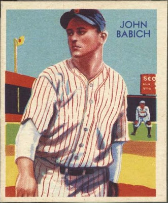
Here's an interesting question sent in by Brian:

Q:

"I have a 1934-36 Diamond Stars #82 John Babich (Blue Back) without the Brooklyn on the front jersey.  Is this card an error?  If not can you tell me why this might be?"

A:

I don't own the card, so I had to make a quick online search. Sure enough, the cards found had both variations. Here he is with the team name:


And here he is without any designation on his jersey:


To answer the reader's question, it's not an error card (technically, nothing is wrong, so by definition it can't be an error). What this is would be a variation. While errors and variations are often lumped together by hobbyists, there's a distinction nonetheless.

During my (unscientific) online research, the backs of the three "non-Brooklyn" variations all had a blue back from 1936, but none of the others did. Since Babich's card was one of many in the set with three different back variations, it's possible that the name was removed during the last printing because he was traded to the Boston Braves before the 1936 season. There wasn't a way to produce a new card in time, so National Chicle "fixed" the problem by altering the jersey.

However, this is speculation, so I'm tossing this one out to my readers. Does anybody have any info on this one?