


The was the last year of the ABA's existence, which makes this set the last 300+ card Topps issue before they stopped making basketball cards in 1982. Like the earlier sets I mentioned in that blog entry above, the set is broken up by league. Cards #1-220 featured NBA players, and 221-330 were all from the ABA. League leaders cards start off each section, and playoff games get cards as well.
Like many basketball sets, there were elements taken from other sets. Here's an example of a card from the 1975-'76 set:

Card #21 -- Gary Melchionni, Phoenix Suns
(Love the sun graphics on the shorts.)
The stripe in the corner is reminiscent of the 1966 Topps baseball set. However, the two-color design is very much a 1970s thing. I didn't get any All-Star cards from this set so I can't show any off; the players who were named to the 1st and 2nd team All-Star squads also received a solid color stripe across the bottom of the card, and the stripe in the corner reverts toa single color, but with five stars in it. One eneat effect, though, is the font Topps used for the player and team names. They don't appear to be borrowed from another set (unless there's a hockey set I missed).
The backs definitely make them look like basketball cards, with several images of game-action play:

Card #7 -- Tom Van Ardsdale, Atlanta Hawks
For players whose careers are shorter, there are additional cartoons below the highlight "ball," which forms a complete circle when it's not being obscured by stat lines. The blue/green design might be one of the best Topps used on its hoops cards during the 1970s.
For the first time, Topps included team photo cards. I only ended up getting two of them, but need to say that one of the others shows the Seattle SuperSonics getting off a 747 (Not a "supersonic" plane, but it's still a neat idea). While most pictures looked like this:
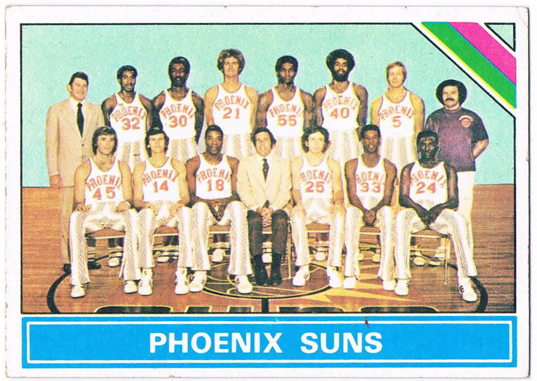
Card #217 -- Phoenix Suns Team Card
With the ususal assortment of unintentionally hilarious bad leisure suits, wide-bottom pants, gym gear and hairstyles, it's a reminder that entire cultures could make silly decisions from time to time.
But take a look at this:

With the ususal assortment of unintentionally hilarious bad leisure suits, wide-bottom pants, gym gear and hairstyles, it's a reminder that entire cultures could make silly decisions from time to time.
But take a look at this:

Card #212 -- Los Angeles Lakers Team Card
Floating head cards! Since there are fewer players on a basketball team than baseball, it may not look quite as morbid as many 1970s Chicago Cubs team cards do. That said, it still looks like somebody running the guillotine was bored and decided to waste time rearranging the victims.
I miss those old Suns uniforms. This is from the time I first started following basketball. The 1975-1976 season was a magical one for us Suns fans!
ReplyDeleteI really like this set especially for the ABA cards. Check out the San Diego Sails team card, cobbled together. One problem with the set is the backs were occasionally very dark, making it nigh impossible to make out the card number on the upper left. As I get older it is getting tougher to see that stuff. The photography is alternately very colorful or very plain, and there is quite a bit of airbrushing.
ReplyDelete