Showing posts with label 1968 topps. Show all posts

Friday, March 2, 2012

Names, Tags, Labels and Slang

My last blog entry featured a link to this page of hobby-related slang used by members of OBC, a group of "old school" style collectors that happens to include me. That list includes several "names" given to refer to certain sets.

For example:


1955 Bowman is referred to as the "TV set" for obvious reasons.


 "Horizontals" refer to 1960 Topps, although I argue that 1955 and '56 Topps should also have that name. Especially when you consider that not all '60 Topps cards are horizontal.


1962 Topps are called "Woodies." I suppose the label could also apply to 1987 Topps, but OBC officially stops paying attention in 1980. I didn't say that was right...it's just the way they do things.


"Burlap" refers to the outer edges that appear on 1968 Topps cards.


"Cool Gray" is a nickname for the 1970 Topps set, whose design has been mentioned as one that has aged a lot better than many expected.


 1971 Topps are called "Black Beauties," a name that is quite apt.

 "Psycho" is the name given to the 1972 Topps set, both as a result of its design and that little issue of the higher-numbered cards that keep many from completing it for an awful long time. Not that I'm bitter about it or anything...


And then there's the term "jiggler," which is said to refer to the 1962 and '63 Jell-O sets even though the term is rarely used. In fact, I don't recall ever hearing it used in any type of conversation.

Of course, OBC isn't alone when it comes to giving names to various sets. Right here in the Blogosphere, Night Owl is keeping a list of "define the Design" nicknames for several sets, both within and beyond the scope of what OBC deems its "window." There's one thing for certain...we collectors definitely use slang and jargon, which we can use to identify each other in our own unique geekiness.

Monday, September 19, 2011

Disappearing Act -- the Football Edition

There was one really lousy thing about collecting Topps football cards when I was a kid.

They didn't look right. The logos were airbrushed off the helmets, and when I was young I didn't understand why the players on the cards didn't look like they did when they played on TV.

Here's a card in my collection from 1968:


Andy Russell is posing helmetless, as most players of that era did. However, he's holding his "brain bucket" in his hands, and you can see the familiar logo.

In 1970, Topps lost its right to include NFL logos (including team logos) on its cards. It wasn't really noticed that year, as all the pictures used had players in positions without their headgear. In '71, only three cards needed to get the airbrush treatment; since none of the three were Steelers, I don't have one to show here.

In 1972, there was a subset of "Pro Action" cards and an increased commitment by Topps to show "game day" pictures...and they really stand out by how awful they are. And in the high-number set, here's one of the two Steelers:


It's Andy Russell again, but the helmet in his hands has an ominous shadow right where the logo should be. And he seems to be inadvertently giving "the finger" to Topps as an expression of disapproval.

There was one other thing that needed to be removed from some of the cards...


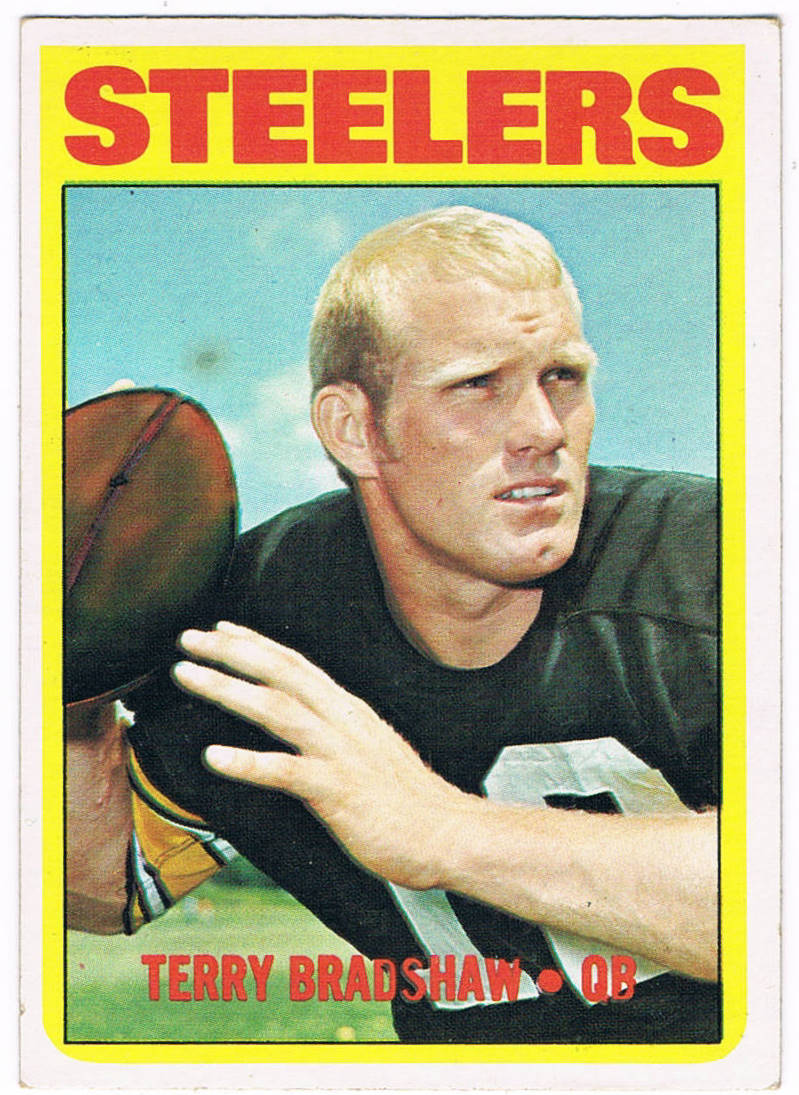
Take a closer look at the football in Terry Bradshaw's hand:


It's been airbrushed as well, in order to get the NFL logo off of the pigskin.

It would take until 1982 before the logos returned to Topps cards. It was a really long decade for football card collectors.