Wednesday, February 29, 2012

Leap Day Psychedelic Treat

Today is Leap Day, which only occurs once every four years. In honor of that, here's an awesome card that was shared with me from a fellow collector named Steve that shows a really distorted image of a true original:


1972 Topps #179 -- Dock Ellis, Pittsburgh Pirates

While cards that feature out-of-register photos are generally viewed unfavorably by collectors, the fact that it is on a 1972 Topps card (which are lovingly called "Psychos" by my friends over at OBC) makes it look like you need a special pair of 3-D glasses to look at it.

Additionally, it's appropriate that the card pictures Dock Ellis, a pitcher who is notoriously best-known today for tossing a no-hitter in 1970 while he was under the influence of a hallucinogenic. Here's the story in Dock's own words:


That video never fails to make me laugh. The guitar lick you hear in it, by the way, is from the 1970/71 song "(Do the) Push & Pull (Part 1)" by Rufus Thomas. It adds with the artwork and the audio effects to give it a humorous vibe.

(As a public service announcement, I need to point out that drugs aren't a laughing matter, and neither is the abuse of them. But the description Ellis gives of the effects he experienced on the field that day are just priceless. That said...kids, don't try that.)

Monday, February 27, 2012

"Fake Design" But Not Fake Cards

Here's a card from the past that doesn't get seen as often as it once did:


It's an E91a card of Roger Bresnahan. Here's the back:


As you can see, it was issued by the American Caramel Company, the same company that issued the various E90 sets, as well as the E120, E121 and E122 sets of the 1920s. The E91s were released in three different series, which are generally believed to have been issued in 1908 (E91a), 1909 (E91b) and 1910 (E91c). Each set has 33 players, and each series has a different checklist on the back.

However, these are among the least desirable of the "E" series cards due to the fact that they aren't always picturing the player featured. Due to a generic-type design, sometimes the same picture would be used in each set for a different player.

As a result, you would get the following cards (images grabbed elsewhere on the Web):

E91a "Iron Joe" McGinnity

E91b "Rube"Marquard

E91c Joe Wood

That might have put a crimp in the old habit of searching through cards saying "got 'em, got 'em, need 'em..."

Friday, February 24, 2012

Evolution of a Classic Design, The Prequel

The following picture shows the evolution of Play Ball's design in the three years it made cards:


(This image can be right-clicked and opened in another window if you want to see it larger.)

The first set was issued in 1939 by Gum, Inc. The "plain white border" look was one that would be revisited several times in the future by the company (after they changed their name to the Bowman Gum Co.). In 1948, that company would issue smaller-sized cards with the same design that was used nine years before it. In 1950, the design was given color, and in 1953 they released sets that had both color and black-and-white pictures.

The Play Ball design was given an elaborate makeover for 1940. While the pictures remained black-and-white, a banner and several baseball-related elements were added to "frame" the photo, with many players given a nickname in quotations. In 1941 the banner was still there, but the bat, glove and catcher's mask were gone. However, color was added to the card, sometimes emphasizing shadows as shown in the example above.

Ironically, the back designs didn't change all that much from year to year.

Wednesday, February 22, 2012

The Ultimate "Double Threat"

In its 1955 baseball card set, Bowman got around the problem of not having all the players under contract by issuing cards of umpires in the final series. There were 31 in all, including this one:

Card #315 -- Cal Hubbard

There's one little thing to note, however: while the other 30 arbiters are shown in those black uniforms they once wore during the games, Cal Hubbard is shown in a suit coat and tie. And he's wearing glasses, which umpires usually get told by fans and managers alike that they need.

There's a reason for this picture. Hubbard had been a major league umpire from 1936 until a hunting accident after the 1951 season damaged the vision in his right eye. He was forced to retire, but was named the supervisor of umpires in 1954. So, he was an executive when this card appeared, which explains the suit.

Before Hubbard took his place behind the plate, he excelled on a gridiron. He was an offensive tackle with the Giants, Packers and Pirates (the team now known as the Steelers) from 1927 through 1936. He was considered to be one of the league's best players, good enough to be inducted into the Pro Football Hall of Fame's inaugural class in 1963. He actually began umpiring in the minor leagues during his playing days, as his "summer job" when he wasn't playing football.

When he was inducted in the Baseball Hall of Fame in 1976, he became the fifth umpire to earn the honor. He also remains the only person who's been inducted into the Hall of Fame in both sports.

Monday, February 20, 2012

RIP "Kid"

Hall of Fame catcher Gary Carter passed away last week. Although most of his cards appeared outside of the time frame focused on in this blog, he still had some that did. Rather than rehash what others have said, I'll just let the others speak.

His first card appeared in the 1975 Topps set, as a multi-player Rookie:


This card was shown by Slangon, who was one of the first bloggers to report the sad news (or at least...he was one of the first I saw on my Blogroll).


Soon after that, Big Hair and Plastic Grass featured this 1976 Kelloggs' card in its own tribute. The site is written by Dan Epstein, who has written a book about baseball in the 1970s and does a better job of saying what I would have come up with.


Of course, Night Owl also writes for a living...and offered up this post that examines the inevitable feeling of mortality that seems to accompany these sad bits of news as we get older. I was in the ninth grade the year the Mets won the World Series. Seeing the leader of that team pass away from cancer certainly makes me think.

But the reason I really need to mention "The Kid" in this blog is outlined on this little factoid that was placed on the back of Carter's 1981 O-Pee-Chee card in two languages. 1967ers from Diamond Cuts and Wax Stains remembered the decade Carter spent as one of the biggest baseball stars in Canada.

We didn't just lose a Hall of Fame catcher...but we also lost a person who was a fellow collector. One of my long-time collecting buddies is Bob D'Angelo, a Tampa-based journalist who talked with Carter in 1981 about his collection. Here, he shares that story, as well as Carter's reaction to seeing himself on cardboard for the first time in 1975.

Rest in Peace, Kid.

Friday, February 17, 2012

Tall(er) Boys

Here's a card I saw while working at Irv Lerner's table during last year's National in Chicago:


Well, it wasn't this card. But you know what I mean.

This was included as an insert inside wax packs of 1969-70 Topps basketball. While those cards are called "tall boys" due to their size, these inserts were even taller and had to be folded in order to fit inside the packages. When unfolded, they stood 9 and 7/8 inches high and the standard 2 1/2 inches wide. They were also printed on thin paper rather than cardboard, so many of these have become rather brittle.

An arrow at the side indicated how tall the player was, and the taller players like Lew Alcindor and Wilt Chamberlain were drawn to meet that height. There were a total of 23 players who were subjected to the cartoon treatment; it is rumored that one more was planned but Bill Russell was pulled from production when he retired.

Wednesday, February 15, 2012

They're "Magic"

Here's a card that you might have never seen before:


It's from 1948 (and probably into 1949 as well), and is really small, measuring 7/8" wide by 1 and 1/2" tall. It may not seem like much, but this is the very first baseball card set ever produced by Topps. That's right...before the 1952 Topps set, or the slew of 1951 issues, they actually released 19 baseball cards as part of a larger series of 252 cards.

These were called Magic Photos, and were issued as undeveloped pictures that needed to be made "wet" (some could dip them in water, and many would just spit on the cards) before the image appeared. The backs had a question that the picture could answer, but because of the manner they were treated, the pictures sometimes developed rather poorly.

The set of Magic Photos went way beyond baseball. Other sports (basketball, football, wrestling, Boxing) were featured, and so were actors and actresses. There were also American historical figures:


As well as landmarks and monuments:


Now there's a card that shows some uneven development.

If you're interested in finding out more about this set, check out The Topps Archives, which dives pretty deeply into the issue and its series.

Monday, February 13, 2012

Neat Design for Cards

As part of my ongoing "side job" as a freelance writer working for the Card Connection Website, I come across some really neat designs from time to time. Currently, I am going through hockey sets and just stumbled across the last set Parkhurst issued in 1963-'64. They predated Topps as issuers of hockey cards, and for several years the two companies split up the six teams in the NHL.

And that team focus is part of the design of this set:


All of the Detroit Red Wings have this background image behind them, regardless of what their actual nationality was. Since they were the only team from the United States included in the set, this is appropriate.

So let's move North of the Border:


This is the background behind all of the Toronto Maple Leafs players. Although we now know the red-and-white flag with the maple leaf on it to be the National Flag of Canada, our friendly Neighbors to the North didn't actually adopt that as their flag until 1965. Before that, the Red Ensign shown above was flown, or the Union Jack (since Canada was still a Commonwealth of England), which was a part of the design. The Red Ensign is still in use, as the basis for the design of the Provincial flags of Ontario, Manitoba and British Columbia.

Here's the twist...the Red Ensign was heavily favored by the English-speaking areas of Canada. So, for the players who played on the team from the heavily French-speaking Quebec:


The Montreal Canadiens didn't get a flag at all. Instead, they had parallel solid-color bars placed behind them. The colors changed; some had pink bars, as shown above, but others had blue. And there were also green-and-yellow and red-and-yellow patterns. I am not sure if there was a reason for which player received which color, if you know, mention it in the comments section.


The back design is really basic, considering the front design. There are some pretty basic stats and vitals...but most of the back is dominated by an advertisement written in two languages. The tabletop hockey game you see above was available for one dollar (Canadian, as it has an Ontario mailing address) and ten wrappers. I wonder how well that game was built, or if it was little more than heavily-reinforced cardboard.

Friday, February 10, 2012

On the "Strip"...

It's been a little while since I've focused on "strip cards" on this blog. They were named by their manner of being issued by themselves as strips of between six and ten cards at one time. They really don't get a lot of appreciation in the hobby because they're often hard to identify, they look a lot like they were cut from a newspaper comics page and they can be easily damaged.

I have posted about the W512 set here and here, mentioned the W515-1 set here and answered a question about a W555 card here. Technically, the MP & Co. sets of 1943 and '49 and the 1948 Blue Tints were categorized as "R" series sets but appear to have been issued as strip sets as well, so they should be brought into any discussion of strip cards.

So, let's open up the textbooks to the "W" chapter and look at a few more sets...

 W514 Sam Rice

Issued between 1919 and 1921, the W514 set was one of the larger strip card sets. There were 120 cards in all, with four cards that can be found as variations due to trades. The number in the lower right of the player's picture area is pretty helpful in identifying cards from the set. One major feature of the set is that it includes seven of the "Eight Men Out," (Jackson, Cicotte, Williams, Felsch, Gandil, Weaver and Risberg) and the card of "Shoeless Joe" is his only appearance on a strip card.

W520 Stan "Kovaleski"

The W520 set appears to have been issued around 1920. It is a relatively small set, with 20 numbered cards. Three of the cards (including the Stan Coveleski card shown above) have the player's last name misspelled. Where the W514 card had the player's full name, team and position, this one simply has a last name, with a number in the lower right corner.
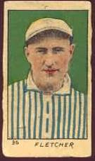
W522 Art Fletcher

Collectors often confuse the W522 set with the W520. They were issued around the same time, had the same 20 players and featured the exact same pictures. However, the cards were ordered differently and given different numbers (running from 31-50). The number is also moved over to the left side of the card. It is not known who made either set.

That is a little more exposure for a card type that gets little attention. That not only deepens the mystery about them, but also keeps their prices really low due to a lessened demand.

Wednesday, February 8, 2012

Where's Joe?

Today's post features an item that is owned one of my long-time collector friends:


It's a complete box (with flaps) from 1963 that includes three Bazooka cards on it, including one that shows Willie Mays. Over the years, these boxes have been cut into singles or panels, with complete boxes being harder to locate. For some reason, a number of copies of this particular box have found their way into the hobby and have made this one a lot easier to find. It's been speculated that a warehouse find (or an extra unused case) has been found.

Bazooka was a Topps product, which was on the scene shortly after the end of World War II. In fact, the immediate success of the brand brought some of the extra profit that would eventually be sunk into the company's cardmaking efforts. The familiar comic strip, complete with a send-in offer and a fortune, was wrapped around the gum slab by 1953, and Topps added cards to the multi-count retail boxes in 1959.

This box from 1963 contained 20 pieces of Bazooka gum (with 20 comics), the three cards you see in the picture, and five more cards tucked inside. Those were from a separate set of cards called 1963 Bazooka All-Time Greats. Here's an example:


For those of you who thought that gold foil was an element of baseball cards that Topps embraced in the early 1990s, here's proof (along with the 1965 Embossed cards) that they were definitely enamored of the shiny effects well before that.

There were 36 cards in the regular Bazooka set in 1963, and 41 of the All-Time Greats. The All-Time Greats were revisited in 1969-70; in those years, they were placed on the side panels of the box itself. The 1963 cards are distinguished by the fact that they're numbered. The later cards are also missing the gold leaf and have a different design.

Monday, February 6, 2012

In Action Cards - Series 4

Today, I'll continue the series I've been doing here where I'm showing the backs of the "In Action" cards from the 1972 Topps set.

That set was split into six series through the year, with each having a subset of 24 cards that had a player and then a special "action" card of the same player. So far, I've shared the following series:

Series 1
Series 2
Series 3

In series 4, the 12 cards included one (also shown in each of the previous series) that previewed the puzzles that would be included in the next two series. The other 11 recapped highlights from 1971, under the logo of the home city of the player who is being honored. I'll show six of them today and save the rest for later.


Friday, February 3, 2012

Pre "Big Game" Post, Part 2

There are two reasons for the name of this entry. First(and I really wouldn't need to say this now, but this post will be readable for a long time to come), the Super Bowl is going on this weekend. Second...last year's post had a similar title and racked up a whole bunch of hits.

When it comes to football, I only collect one team, and they aren't taking the field for the title this year. So, I'll do a "history lesson" that doesn't need to include them.


But before I talk about this card, I need to stop and talk about where this image came from. It comes from a site called The Vintage Football Gallery, which really needs to be on your bookmark page if you're at all interested in vintage football cards. The owner of that site, Mike, is also the writer of Nearmint's Vintage Football Card Blog, which appears right here in my Blogroll.

This card is the only football player included in the 50-card Goodwin Champions set from 1888, also known as N162. The link in the previous sentence goes to my own site, as it is a general sports set that includes baseball players as well. It features Henry Beecher, the captain of the Yale football team and a relative of Harriet Beecher Stowe (she wrote Uncle Tom's Cabin just before the Civil War). It is regarded to be the very first football card in existence.

Class is dismissed. Enjoy the game.

Wednesday, February 1, 2012

Small "Concession"

Today's card comes from 1956:


This is from the era when the PCL was largely seen as a "third" major league because there were no big league teams west of St. Louis. While that would soon change, these cards would remain in release for several years after baseball went West.

Measuring two inches by three inches, they were smaller than the "regular" baseball card size. The cards were released each year from 1954 through 1968 and only feature players from the Seattle Rainiers (or Angels, as they were called beginning in 1965). They are called "popcorn cards" because they were distributed along with the boxes of popcorn sold at the concession stands in Seattle's Sick's Stadium.

Say that three times fast.

Generally, there would be about 20 cards each year and would be changed as players came and went. As a result, there is a possibility that "new" cards might surface at some point.

Many years, the cards were blank-backed. However, in 1956 there were two types: a blank-backed card and one that has an advertisement for Gil's Drive-in Restaurant:

Looks like Gil's Drive-In is still in Seattle, but at a different address today.