Showing posts with label Hockey. Show all posts

Monday, September 10, 2012

A Different Type of "Scratch-Off" Card

The rookie card of James Brown is pretty well known in the hobby. Today, let's take a look at the back of the card instead:


Notice how there's a rather large are at the right with a trivia question, and that the answer can be seen when the area is rubbed with the edge of a coin. Here's a back where the answer is more visible:


Normally, the card that has been unscratched will sell for more than one that has been scratched, but this is a point that often gets overlooked by sellers who are content to just provide scans of the card's front. That can lead to some hard feelings when it gets sold to a collector who cares about condition and that collector flips it over.

Note to sellers: a scan of the back for all cards, not just the ones with scratch-off areas, might be helpful here. Collectors who are more condition-conscious will know beforehand whether the card has been scratched, and it'll help eliminate most of the returns that result. I know it's not many...but everything that staves off any headaches is a good thing in my opinion.

The scratch-off area has been with Topps football cards since before that. In fact, their football set in 1951 had a covered area on the back that could be scratched off:


The set's name -- Magic -- was a reflection of the fact that the colleges were obscured and that the owner was forced to look under the gray area to find out what it was. While many cards that have been scratched off look nice, the process of an 8-year old kid in 1951 using a penny or nickel to scratch the back didn't always lead to nice results. However, the scratch-off area doesn't seem to be as big a deal as one would think...unless the scratching left gouges in the card itself.

The process of having a trivia question with a scratch-off area was part of football cards (on and off) in both Topps and Philadelphia cards through 1970, but the gimmick has found its way into other sets as well: 


For instance, here's the back of a 1963-'64 Topps hockey card of Stan Mikita that features a bilingual question...


And a 1964 Topps card of Hank Aaron that reveals a question about a home run champ...though not about Aaron or anybody on his team.

Wednesday, May 30, 2012

Die-cut Cards From the North

Here's a card I recently uncovered while doing research for one of my other freelance jobs:


It's one of five sets (called "series" by its manufacturer) that have been lumped into the V304 catalog designation in the American Card Catalog. Issued during the 1936-37 hockey season, it was one of several sets released by O-Pee-Chee in Canada long before their affiliation with Topps. Of the five "series," this set was the only one designed with a die-cut that allowed the top of the card to be folded over to allow it to "stand" on its own. 

Fellow blogger 1967ers gets a little deeper into the set's design here.

They seemed to like the design, as they used it the next year for their only baseball set of the era:


I showed this card here last year, and explained the similarity with the 1934-'36 Batter Up set.

Monday, April 23, 2012

Pre-NHL Hockey Cards

Today this blog features some of the earliest hockey cards. They are tobacco cards from the same era when  the T-series cards appeared. Unlike their American counterparts, however, these didn't have any brands advertised on them. I'm not sure if that was due to Canadian regulations; perhaps one of our friendly readers in that country can add a comment to explain.

What we now know as the National Hockey League wasn't organized until 1917. Before that, the main professional league was the National Hockey Association and it began play in 1910. Later that year, it is believed that this 36-card set appeared:

C56 Hockey #3 -- G. Roberts

Another thing that is different from most American-issued tobacco cards is the fact that these are numbered. Otherwise, they're the same size as the T206 and similar cards.

When Jefferson Burdick came up with his nomenclature for the American Card Catalog, he lumped all of the Canadian-issued tobacco cards -- regardless of their sport -- into the C-series. The grouping included one baseball series as well. Rather than using a specific date, he went by manufacturers when he knew them, by card size and by the set's subject. That's why the numbering system for the set from 1911-'12 might look odd at first:


C55 Hockey #20 -- Fred "Cyclone" Taylor

C55 was issued later but comes before the C56 set in Burdick's book simply because the banner on the back says "Hockey Players" and comes before "Hockey Series" alphabetically. There were 45 cards in the set, with one card having two variations.

One of the neat things in this set's design is the way it uses two hockey sticks to form part of the border. The player above is Fred "Cyclone" Taylor, one of the first professional hockey stars. Before Babe Ruth famously out-earned the President of the United States, Taylor earned more money than Canada's Prime Minister.

For 1912-'13, the "tobacco" era was largely over in the U.S., and in Canada the color was dropped from the cards:

C57 Hockey #46 -- Jack LaViolette

C57 is also the hardest of these three sets to complete, and ironically has the most cards. The complete set has 50 cards.

The storied Montreal Canadiens club was established during the NHA's tenure, as opposed to other clubs, which largely came from competing leagues. They were put together in order to have a French "alternative" that could interest hockey fans in Quebec as well. Since then, all the other teams around them came and went, but the "Habs" are still around today and have enjoyed long spells as a dominant club. And Jack LaViolette (shown above) was their leader and first coach.

The tobacco cards stopped there, as cigarettes largely migrated to using coupons and other premiums. As for the NHA, they were so affected by the conscription of players into the Army during World War One (which Canada entered in 1914) that there was a team made up entirely of players who'd enlisted in the Army. However, the thing that shut the league down was a money dispute. Several owners feuded with Toronto Shamrocks owner Eddie Livingstone and ended up forming the NHL in 1917 using the NHA as a framework.

Monday, February 13, 2012

Neat Design for Cards

As part of my ongoing "side job" as a freelance writer working for the Card Connection Website, I come across some really neat designs from time to time. Currently, I am going through hockey sets and just stumbled across the last set Parkhurst issued in 1963-'64. They predated Topps as issuers of hockey cards, and for several years the two companies split up the six teams in the NHL.

And that team focus is part of the design of this set:


All of the Detroit Red Wings have this background image behind them, regardless of what their actual nationality was. Since they were the only team from the United States included in the set, this is appropriate.

So let's move North of the Border:


This is the background behind all of the Toronto Maple Leafs players. Although we now know the red-and-white flag with the maple leaf on it to be the National Flag of Canada, our friendly Neighbors to the North didn't actually adopt that as their flag until 1965. Before that, the Red Ensign shown above was flown, or the Union Jack (since Canada was still a Commonwealth of England), which was a part of the design. The Red Ensign is still in use, as the basis for the design of the Provincial flags of Ontario, Manitoba and British Columbia.

Here's the twist...the Red Ensign was heavily favored by the English-speaking areas of Canada. So, for the players who played on the team from the heavily French-speaking Quebec:


The Montreal Canadiens didn't get a flag at all. Instead, they had parallel solid-color bars placed behind them. The colors changed; some had pink bars, as shown above, but others had blue. And there were also green-and-yellow and red-and-yellow patterns. I am not sure if there was a reason for which player received which color, if you know, mention it in the comments section.


The back design is really basic, considering the front design. There are some pretty basic stats and vitals...but most of the back is dominated by an advertisement written in two languages. The tabletop hockey game you see above was available for one dollar (Canadian, as it has an Ontario mailing address) and ten wrappers. I wonder how well that game was built, or if it was little more than heavily-reinforced cardboard.

Monday, January 30, 2012

An Alternate Hockey League

At one point in the 1970s, three of the four major sports had rival leagues playing against each other. Baseball had its own labor problems, but the other sports had to deal with competition. Basketball had the American Basketball Association, the World Football League took the gridiron and hockey had the World Hockey Association.

The WHA was brought about in part to circumvent two things that plagued NHL players by 1972: first, they were paid the lowest avearge salary of any major sport, and they were also tied to a team for an entire career by a reserve clause. Yes, they could be traded, but that was up to the teams rather than the players. In 1972, players were attracted to the new league by the promise of higher salaries and the elimination of the reserve clause from any contracts. The league wasn't initially considered to be a threat because it attracted college players, retired NHL veterans and the occasional star like Bernie Parent.

However, things changed when superstar Bobby Hull signed up. In an interview, he jokingly said he'd jump to the new league for a million dollars a year, a ridiculously large amount at a time when the average hockey player earned $25,000 a season. The Winnipeg Jets offered him that amount, and he took it. Other NHL stars followed, like Gordie Howe, Jacques Plante and Gerry Cheevers, but the league also scouted for new talent overseas. Europe and the Soviet bloc were largely ignored by the NHL, but were attractive to the WHA.

Collectors of Topps hockey cards might have never even known that another league existed because the company never acknowledged the WHA in any of its sets until the league fell apart. However, the Canadian-issued O-Pee-Chee featured them.

First was the 1972-73 base set. It was the new league's first season and OPC's final series that year included nothing but WHA players:


Since there weren't really any pictures of players in their WHA uniforms, they were airbrushed in...and in some cases, they didn't even look to be suited up at all.

For four years beginning in 1974-75, O-Pee-Chee issued separate sets of WHA cards that weren't part of their base NHL set. The first year was a 66-card  that features a horizontal design and a generic team banner:


The first card in that set featured Gordie Howe, a legend who came out of retirement to play in the WHA, along with his two sons on the same team.


In 1975-76, the WHA set expanded to 132 cards. One subset was added, and this card is from that:


The first and second team All-Star squads ran through the halfway point of the set (cards 61-72). The stars and "All-Star" banner are simply an addition to the base card design.

In 1976-77, the WHA set remained at 132 cards. The All-Stars return, along with six cards showing the league leaders in several different categories and three that recap the postseason games. However, the base cards were given a little more design to look like they're hockey cards:


In 1977-78, the WHA set was cut back to 66 cards and all of the subsets (except for the one checklist card that appeared in each of the league's sets) were eliminated. There was one card commemorating Gordie Howe's 1,000th career goal, but the rest looked like this:


The WHA played its final season in 1978-79. At the time, the league was struggling financially and several of its teams were folding. Sensing their inevitable doom, they tried to negotiate a merger with six teams going into the NHL. Eventually, four teams would make the transition: the Edmonton Oilers, New England Whalers, Winnipeg Jets and Quebec Nordiques. Perhaps realizing the ship was sinking, no WHA cards were issued during that final season.

In 1979-80, the four teams began playing in the NHL and appeared as part of both Topps' and O-Pee-Chee's base hockey sets. In Topps' set, a card was issued that showed the logos of the NHL's newest teams:


As you can see, the New England Whalers changed their city name. Today, all four franchises are still in the NHL but only Edmonton remains in the same city or has the same team name.

Monday, November 14, 2011

Cool Cardboard Creations

One of the charges that has been leveled at Topps during its periods of monopolization over the card industry is the fact that many of its designs began to get generic -- some would say "stale" -- as the years went on. There is a lot of merit to that suggestion (and I really wish the Topps people could see this and take it to heart...but I am not going to hold my breath).

However, I came across this card during my current job of writing material for the Cardboard Connection Website:


This is the design of the 1971-'72 Topps hockey set. It features a player picture superimposed over a solid-colored background and the set inside a circular "frame." The team name is designed to have an upward curve that really gives it the look of something you would expect from the early 1970s.

Here's what the back side of the card looks like:


While better colors could have been chosen, there is a very important feature on these cards: for the first time, Topps used year-by-year statistics on the backs. For many years, they only used the stats from the previous season and only began adding the accumulated lifetime numbers in the 1969-70 set.

This was also the first year of these cards:


The first six cards of the set featured the leaders in several statistical categories. Topps had included a Leaders subset in its baseball sets for years; however, the other sports' sets were smaller and didn't get them until the early 1970s.

One card in the set was a checklist, which allowed the collector to keep track of all the 132 cards in the set:


It uses the same curved design that was given to the team name on the base cards.

Ever since Topps and O-Pee-Chee had begun to issue separate sets in 1968-'69, the OPC issue was always larger and more "complete," while the Topps set was normally an abridged version. However, this year was a little different: the Leader cards above were only included in the Topps set, as was a base card of "Mr. Hockey," Gordie Howe. As a result, Howe's card is treasured even by the collectors who rarely venture away from OPC hockey.

Monday, October 17, 2011

The Hockey Season is Underway...A Glimpse From 50 Years Ago

With the NHL hockey season now underway, here's a look at a Topps set from exactly 50 years ago.

The 1961-'62 Topps hockey set was designed with the game of hockey in mind. Here's what the front of the card looked like:

Card #55 -- Andy Hebenton, New York Rangers

The player's name, position and team are placed inside a puck icon. This was the first time any hockey-specific equipment was used in the design of a Topps set. The player picture was generally an action shot, which was superimposed over a generic game picture.

The set only featured three of the NHL's six teams, and those three teams were grouped together by number. Cards 1-22 featured Boston Bruins, cards 23-44 had Chicago Blackhawks and the New York Rangers made up cards 45-65. Players from the Red Wings, Maple Leafs and Canadiens would show up on Parkhurst cards that year.

The puck would also find its way to the back of the card:


As you can see from the illustration, the cards were bilingual. There was a single line of stats; up to that time (and for several years afterward), Topps did not use lifetime numbers on its hockey cards.

Each team's first card had the head coach. This was the first time Topps used the coaches in their hockey set. The coaches had a different design:


Card #23 -- Rudy Pilous, Chicago Blackhawks


The design looks like a TV set turned on its side. The same design was used for the rookie players that appeared near the end of each team's series:


Card #62 -- Rod Gilbert, New York Rangers

Topps continued the "TV" design on six "action" cards (two for each team):

Card #64 -- Going, Going, Goal!

This was similar to the Highlights cards from the 1961 Topps football set.

Each team also featured a card that had the assembled team photo:

Card #20 -- Boston Bruins Team Card

Finally, the last card in the set was a checklist card:

Card #66 -- Checklist card

As you can see, each team is clearly set into its own section of the set. Collectors of 1961 Topps baseball will recognize the same design, with the game-action pictures on both sides of the card. This was also the first checklist Topps used in its hockey set.

Monday, October 3, 2011

In Celebration of the Hockey Season

Here's a neat set I was just writing about as part of my gig with the Cardboard Connections Website:


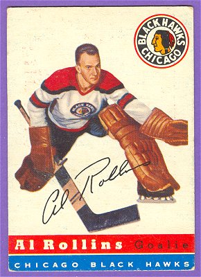
This is the only hockey set Topps issued in its larger-size format. The set was released in 1954-'55 and consisted of 60 cards. Due to territorial issues and the presence of another company issuing hockey cards in Canada (Parkhurst), the set contained only players from the four NHL teams them playing their home games in the United States: the Boston Bruins, Chicago Black Hawks, Detroit Red Wings and New York Rangers.

The backs reflect the American origin of the teams:


The backs are printed in red and blue ink on a white card stock. One thing that may seem odd to long-time collectors is the lack of any French translation, unusual for many sets of the pre-O-Pee-Chee era.

After this set, Topps stepped back from the hockey card market for two years, opting instead to watch the market and learn from the competition. In the meantime, Parkhurst issued a set in 1955-'56 that utilized a front design that resembled what Topps had featured in this set.

Monday, March 21, 2011

Recyling -- Topps Style

Last month, I showed how Topps used the same exact design for their football and hockey sets in 1966. There was no attempt to make a subtle change for the sake of collectors who pick up different types of cards so they could avoid getting Stan Mikita mixed up with Nick Buonticonti.

It turns out it wasn't the first time they did that.

That post I mentioned earlier got some feedback from a reader who goes by the handle 1967ers. Shortly after that post, he let me know about his blog, where he says he'll focus on hockey material. This post described the 1964-'65 Topps hockey set, which looked like this:

Card #3 -- Terry Harper, Montreal Canadiens

I immediately recognized the design because of another set:

Card #26 -- Wray Carlton, Buffalo Bills
(Image borrowed from the Virtual Card Collection)

It's the exact same design (and dimensions) Topps used for the 1965 football set. While the team name on the hockey cards are replaced by a city name, they still retain the curvature at the bottom. In addition, the corners are similarly rounded. While both of the cards shown above feature partial body shots and equipment, both sets feature an awful lot of head shots, which look really weird on such large-format cards.

There was a minor change to these cards. Here's the back of that hockey card:


Now look at the back of the football card:


A little more color was added to the cartoon on the back of the football card, a black bar was added to the area around the name, and the stats are in a different place. Oh yeah...the football card shows that it was made in the U.S.A. rather than in Canada. However, the formats are quite similar.

Friday, February 25, 2011

Players on the Tube

On Monday, I revisited an article I'd written several years ago. Today, I'll do it again.

In 2004, I wrote a newsletter article about the 1955 Bowman set and the then-new invention of color TV. The article appeared again in 2007 in the SMR magazine that PSA puts out. Click here to read it (in PDF format).

However, what many collectors don't realize is that the '55 Bowman set wasn't the first to use a television design. That honor goes to the 1950 Drake's set:

Card #22 -- Eddie Stanky

While many collectors remember Drake's for the cards they included on the packaging of their various snack boxes during the 1980s, in 1950 they were a smaller regional bakery and these cards were available in packages of oatmeal cookies or "Jumble" cookies. The cards aren't impossible to collect, but they weren't widely collected when they were new and the black borders make them tough in high condition.

For more about the 1950 Drake's set, here's a link to the set description in my main site.

After 1955, the TV-inspired design never went away. Topps would return to the concept in 1966, for both its football and hockey cards:


The football design used cherry-colored woodgrain, similar to the one used in the '55 Bowman set. However, they removed the "Color TV" faceplate and the knobs below the picture tube to place the player's name, team and position.


The used the exact same design for their hockey cards that year. I borrowed the image of this Mikita card; it very well may be an O-Pee-Chee, judging by the Canadian-styled spelling of "Centre." (Edited: the explanation appears in the Comments section.)

Too bad Topps didn't use the TV-design for its 1966 baseball set. The design they went with is often pointed out as one of the more unimaginative of the 1960s, and even a horizontal design may have been neat, since there hadn't been one of those since 1960.However, Topps didn't toss the TV out the window:


In fact, they used the design as part of the next two years' World Series recaps. That was a good use for the designs, since many fans watched the games on their own televisions.

They even revisited the concept a couple of years after that:


But of course, that was a TV show, so the design was perfectly suited for it.

Wednesday, February 9, 2011

Slap Shot to My Mailbox!

Last week, Tom -- a long-time trading buddy and occasional reader of this blog -- sent me the very first hockey cards to go into my collection.

That's right, a guy who writes a blog featuring vintage cards from all types of sports never bothered to add one of those sports to his collection. And this after growing up near the Canadian border and even following the Montreal Canadiens and Guy LaFleur as a kid. Sorry, but they simply didn't have any hockey cards for sale where I grew up and I never really went out of my way to collect them.

I really should have, though. They have a richer history than football and basketball cards, going back to the same 1910 era as the T-cards and several sets from the 1930s as well.

Tom sent me six cards, and they were all from the 1972/'73 Topps hockey set. That's actually a good set to start out with, since I also appeared that hockey season (made my own debut on December 2, in fact). Here's the big hit of the package:

Card #56 -- Stan Mikita, Chicago Black Hawks

Considered the NHL's premier center during the 1960s, Stan Mikita played with the Black Hawks from 1959-'80 and went to the Hockey Hall of Fame in 1983. I don't know the wait period for the HOF, but three years after retirement is pretty quick.

Knowing I'm a collector who always has an eye for historical things, Tom also included this card in the stack:

Card #170 -- Art Ross Trophy

The Art Ross Trophy is given each year to the top scorer in the NHL. Although the official trophy began to be awarded after the 1947/'48 season, the back of this card shows the leading scorers for each season going back to 1917.

And Stan Mikita won it four times. In fact, Mikita is the only NHL player to ever win the Art Ross Trophy, Lady Byng Trophy (for sportsmanship) and the Hart Trophy (for the MVP) in the same season. And he did that twice, in 1966/'67 and 1967/'68. His card is a great start to a small hockey collection.

So thanks, Tom!

Monday, January 24, 2011

Cool Vintage Hockey Cards

For a Sportscards blog, I really have given short shrift to basketball and hockey. As of now, I've only had one post related to basketball and nothing to show for hockey. Since I haven't collected much of either (despite a 1970s Basketball wantlist that can be seen from my wantlist links on the sidebar) and despite repeated requests for guest articles here, I've had to simply let them slide. However, it's the baseball offseason and the football playoffs are nearly over...what better time to try and get some of the other sports represented while they're still in season?

These images were shared by a buddy of mine from Ontario:


This Lipton box is from 1974-'75. As you can see, there were two cards that could be cut from the box. In all, there were 50 players (with Borje Salming available with either a horizontal or vertical card, for a total of 51 cards). I'm told they're fairly rare...occasionally the 2-card panels and box backs can be found, but the entire box is rare indeed. As you might expect, many of the cards found were cut from the boxes with young hands and scissors...not necessarily a good combination for maintaining top conditions.

I like the image on that Garry Unger card, which show the puck up close (you can click the image to see it larger). He had some other boxes, including this one:


A classic 1970s pose and Tony Esposito in full goalie gear. Great stuff.

In fact, hockey cards go back as far as the early 1900s. There is some really rich history there, something I'd love to show on this blog as I go along.