The 1961-'62 Topps hockey set was designed with the game of hockey in mind. Here's what the front of the card looked like:
Card #55 -- Andy Hebenton, New York Rangers
The player's name, position and team are placed inside a puck icon. This was the first time any hockey-specific equipment was used in the design of a Topps set. The player picture was generally an action shot, which was superimposed over a generic game picture.
The set only featured three of the NHL's six teams, and those three teams were grouped together by number. Cards 1-22 featured Boston Bruins, cards 23-44 had Chicago Blackhawks and the New York Rangers made up cards 45-65. Players from the Red Wings, Maple Leafs and Canadiens would show up on Parkhurst cards that year.
The puck would also find its way to the back of the card:
As you can see from the illustration, the cards were bilingual. There was a single line of stats; up to that time (and for several years afterward), Topps did not use lifetime numbers on its hockey cards.
Each team's first card had the head coach. This was the first time Topps used the coaches in their hockey set. The coaches had a different design:
Card #23 -- Rudy Pilous, Chicago Blackhawks
The design looks like a TV set turned on its side. The same design was used for the rookie players that appeared near the end of each team's series:
Card #62 -- Rod Gilbert, New York Rangers
Topps continued the "TV" design on six "action" cards (two for each team):
Card #64 -- Going, Going, Goal!
This was similar to the Highlights cards from the 1961 Topps football set.
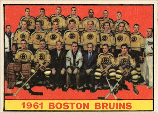
Each team also featured a card that had the assembled team photo:
Card #20 -- Boston Bruins Team Card
Finally, the last card in the set was a checklist card:
Card #66 -- Checklist card
As you can see, each team is clearly set into its own section of the set. Collectors of 1961 Topps baseball will recognize the same design, with the game-action pictures on both sides of the card. This was also the first checklist Topps used in its hockey set.


That looks like a very slick set. I enjoyed the breakdown.
ReplyDeleteMakes me want to look more into the release.
Cheers!
This is one of my favourite Topps sets and I think one of the best-looking sets of the 60s.
ReplyDeleteThere are a number of interesting things about it.
If you look at the back, you see TCG - Litho'd in Canada. In the past, OPC handled the distribution of cards that Topps had produced in the States. As of '61-62, OPC took over the printing (or lithographing) as well. I don't think these were available in the US.
The shots are all photographer's stills. The Hebenton shot is a very traditional hockey shot where the player would skate up to the photographer and make either a two-foot stop or a cut to one side. (If you ever look at old Bee Hive or Quaker Oats photos, you see this all the time.)
They're superimposed on game shots - interestingly, the Hebenton card is over a Toronto game, and Topps didn't have rights to Toronto. (The player above Hebenton's elbow is Bert Olmstead. I'd have to look close to figure the others.) The game-action cards were limited to the appropriate teams.
'61-62 Parkhurst is also a great set. There was also a Shirriff coin issue. Good season for collectors.
This looks like the original for the Hebenton: http://www.mbhockeyhalloffame.ca/asset_library/gallery/players/hebenton_andy2.jpg
ReplyDelete