Wednesday, September 26, 2012

It's Campy...Really

This 3-inch plastic statue features Brooklyn Dodger star Roy Campanella. Really, it does:


Molded in 1956 and sold through Dairy Queen stores that year, Campanella was one of 18 big league players to be included in the promotion. Since half of the players (Campy, Mickey Mantle, Yogi Berra, Larry Doby, Bob Lemon, Eddie Mathews, Stan Musial, Pee Wee Reese and Duke Snider) are Hall of Famers, there is quite an interest in them.

The same 18 players were also featured on statues with cards that year known as Big League Stars. However, while those statues have a bronze color, Dairy Queen statues are white.

Also note the presence of Stan Musial, who was absent in Topps' sets through 1958 and wasn't on any Bowman issues after 1953.

Friday, September 21, 2012

On the Lighter Side...

Here's a "gem" of mine that was picked up at The Nationals:


It was sent to me after I got back from Baltimore, however. At the show, I ran into several of my OBC buddies including Larry "Guru" Tipton, who is legendary in the group for his condition guide. While at the show, he "scored" a collection of cards that were...shall we say, water damaged? After the show, he was kind enough to share cards of this "find" with members of the community.

In fact, he even inagurated his OBC-styled grading service called Guru's Grading Service (GGS). After lovingly grading and labeling many of the cards, he sent them to fellow OBC members as a way of spreading his good fortune.

I already have a 1961 Topps Hank Foiles in my own collection, so I'm not likely to free this one from its slab. Which may be a real treat for my nose.

Wednesday, September 19, 2012

Put a Patch On It

Today's entry goes off the beaten path when it comes to collectibles:


This patch measures 2 1/2 inches by 3 1/4 inches, or just shorter than a standard card. It was made in 1978 and sold by the Penn Emblem Company for $2.50. Actually, the commons are still available in mint condition for around that, and maybe even less. Collectors don't seem to care for them.


There were 103 players available, and Pete Rose had two differently-colored borders. Since the name of the manufacturer doesn't appear anywhere on the patch, the SCD "book" simply has them listed as "1978 Baseball Player Patches." Although the images sort of look like the players pictured -- even without the team logos or any mention of team affiliation -- they've never attracted that much interest.

Monday, September 17, 2012

The Original 1953 Topps Reprints

When "1953 Topps Reprints" are mentioned, many collectors think of the glossy, standard-sized cards that hit the market in 1991. Not this:


The front may look familiar, but the back is more in the style of a 1930s or '40-style back than the way it was presented in its original Topps form:


The term "1953 Topps Reprints" is something of a misnomer. Hobby legend has it that the cards were produced for a banquet dinner and the cards were printed for the attendees as party favors. It's possible the Sy Berger or somebody with connections to Topps was in attendance at a banquet that had ex-sports figures in attendance and the cards were printed to remind everybody that they were once young and athletic.

There were eight cards in the set, three of whom are misidentified by their pictures.Here's a genuine 1953 Johhny Mize for a comparison:


As you can see, the back of the original card had much different info on it, including a different biographical write-up:


By the way...Roy Face went 18-1 in 1959, eclipsing the record that Johnny Allen is credited with. And Johnny Allen wasn't a member of the Yankees in 1937...the Yanks dealt him to the Indians the year before that.

Friday, September 14, 2012

More Recent Arrivals -- 56 Topps

They may not be the prettiest cards I own, but these 1956 Topps cards can tell a story even when they're scuffed like this. Since I have picked up a scanner to use, I've been slowly showing some of my recent additions to my collection...and here are some more of those:


Johnny Antonelli is from Upstate New York (as am I) and has become a part of two bloggers' sites: Night Owl (who featured a much nicer-looking 1956 than this one) grew up near one of his tire franchises and Jeff over at Cardboard Catastrophies (who also has a much nicer 1956 Topps than this) has a player set devoted to Antonelli. Between those two, there's enough background on him as a player...so I'll just focus on the card.

One of the neat things about the 1956 Topps cards is the second full-color action shot. With the background added to the image, the cards really "pop" in a way that they 1954 and 1955 cards (which also had a second image, but no backgrounds) didn't. And the shot of Antonelli delivering a pitch to an unseen competitor is just great.


As for Luis Arroyo, he's just posing for the cameraman here. Yet the stadium backdrop makes the card something more than it would have been without it.

Arroyo actually pitched for the Pirates in 1956. He started the year in the minors and was dealt away in May. The Puerto Rican native was best known for a baffling screwball, as well as being part of the latter days of the Yankee dynasty that made the World Series each year he was with them.

Showing off his windup is Jim Hearn, who was instumental in helping the Giants to overcome a 13 1/2-game deficit to with the 1951 pennant.

But Hearn will be forever remembered by me as my very first 1952 Topps high #...a $4 purchase. When I think of him, that will always be the first thing that comes to my mind.


Billy Klaus is shown here turning a play at second against the Yanks' Andy Carey. I like the way the picture shows tha dust getting kicked up as Klaus throws to first and Carey attempts to take him out. That's how baseball should be played, not the silly "neighborhood play" sometimes used today. Yes, I get that it's there to prevent injuries...but it doesn't seem right.

I just noticed that Klaus is the only non-pitcher in this group of cards.


So, we go back to the pitchers. In fact, this is the third Giant hurler out of the five cards. Liddle came to the tam from the Braves along with Johnny Antonelli -- and Billy Klaus, for that matter -- in 1954, and was part of that year's World Series team. In fact, he was the pitcher to threw the pitch to Vic Wertz that Wille Mays caught and still nailed the runner at the plate...the one play that is still shown from that Series all these years later.

Wednesday, September 12, 2012

Old-School "Pogs" From 1963

When pogs became popular in the 1990s, there were children of the 1950s and 60s who immediately recognized them as new versions of an old relic...the milk bottle cap. Though the concept of caps that could be used in a game predated pogs and even milk caps (Japanese Menko games have existed since the 1700s, for instance), it was still a quaint reminder of a time when local dairies delivered milk bottles to doorsteps and advertised on the cardboard caps that topped their bottles.
 
And that brings us to today's set:


In 1963, a Cincinnati-based dairy known as French Bauer released a set of 30 milk caps that encouraged their clients to visit Crosley Field and see the team play. The 1 1/4-inch diameter discs are blank-backed and feature a die-cut area and a staple that were designed to be broken open to allow the milk inside to be poured out. Predictably, not many of these have survived and examples are a little scarce today.

Two caps are especially prized by collectors: a Frank Robinson and a rookie-year Pete Rose. However, the bottle caps weren't only limited to players. One cap even showed the image of team owner (and long-time baseball executive) Bill DeWitt:


Though considered a common in the set, there weren't a lot of kids excited about old men in suits. Especially a man who later traded Frank Robinson to the Orioles because he felt Robinson was "old." That makes the DeWitt cap one of the tougher commons in the set.

Monday, September 10, 2012

A Different Type of "Scratch-Off" Card

The rookie card of James Brown is pretty well known in the hobby. Today, let's take a look at the back of the card instead:


Notice how there's a rather large are at the right with a trivia question, and that the answer can be seen when the area is rubbed with the edge of a coin. Here's a back where the answer is more visible:


Normally, the card that has been unscratched will sell for more than one that has been scratched, but this is a point that often gets overlooked by sellers who are content to just provide scans of the card's front. That can lead to some hard feelings when it gets sold to a collector who cares about condition and that collector flips it over.

Note to sellers: a scan of the back for all cards, not just the ones with scratch-off areas, might be helpful here. Collectors who are more condition-conscious will know beforehand whether the card has been scratched, and it'll help eliminate most of the returns that result. I know it's not many...but everything that staves off any headaches is a good thing in my opinion.

The scratch-off area has been with Topps football cards since before that. In fact, their football set in 1951 had a covered area on the back that could be scratched off:


The set's name -- Magic -- was a reflection of the fact that the colleges were obscured and that the owner was forced to look under the gray area to find out what it was. While many cards that have been scratched off look nice, the process of an 8-year old kid in 1951 using a penny or nickel to scratch the back didn't always lead to nice results. However, the scratch-off area doesn't seem to be as big a deal as one would think...unless the scratching left gouges in the card itself.

The process of having a trivia question with a scratch-off area was part of football cards (on and off) in both Topps and Philadelphia cards through 1970, but the gimmick has found its way into other sets as well: 


For instance, here's the back of a 1963-'64 Topps hockey card of Stan Mikita that features a bilingual question...


And a 1964 Topps card of Hank Aaron that reveals a question about a home run champ...though not about Aaron or anybody on his team.

Friday, September 7, 2012

More "New" (But Old) Additions

Though I'm using this blog to spread information about sets and vintage cards, I'm still a collector. So from time to time I get to feature some "new" additions to my collection, such as these recent arrivals:

1965 Topps #399 -- Ray Herbert, Philadelphia Philles

For some reason, I've let many of the early 1960s Topps sets fall under the radar in my collection. It's not for any specific reason...In the long run, I'm more focused on 1950s material, while 1970s sets are more complete due to that being when I began collecting myself. However, those longer 1961-'65 wantlists make a tempting target for anybody who has the cards in their dupes boxes.

Ray Herbert had been playing in the majors since before Topps printed cards. He debuted in 1950 but missed a few years in the meantime: 1952 was spent in another uniform, as Uncle Sam drafted him during the Korean War, while he spent 1956 and '57 back in the minors before coming back up for the rest of his career. In 1965, he began with his fourth and final major league club (this is an airbrushed card which shows him as a member of the White Sox).


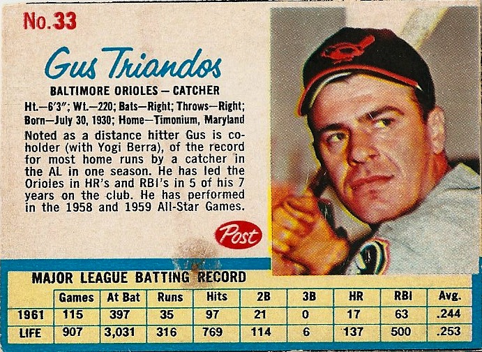
1965 Topps #455 -- Norm Siebern, Baltimore Orioles

Norm Siebern was even more well-traveled, appearing on six different major league teams in 12 years. Starting with the Yankees in the late 1950s, he was one of the players dealt to the A's for Roger Maris. He went to Baltimore before the 1964 season in a trade for Jim Gentile. His time there ended after the 1965 season, as he was dealt to California. After a year there, he went through short stints with San Francisco and Boston before retiring in 1968.


1965 Topps #503 -- Phil Gagliano, St. Louis Cardinals

1965 was the most productive year of Phil Gagliano's career, seeing him get into 122 games. He was a Memphis native (in fact, he and teammate Tim McCarver played together in high school) and earned two World Series rings before he was sent to the Cubs and them the Red Sox in 1970. He closed out his career with a stint with the Reds from 1973-74. Late in his career, Gagliano became a rather effective pinch-hitting specialist, hitting over .350 in that position for both of his last two teams.


1965 Topps #525 -- Eddie Bressoud, Boston Red Sox

Eddie Bressoud came up in 1956 with the New York Giants and moved with them to San Fancisco, In 1961, he went to the Red Sox and stayed there through 1965. Stints with the Mets in 1966 and the Cardinals the next year represented two very different levels of play, and he closed his career out with two games as a defensive replacement in the 1967 World Series. His name invited a nickname of "Steady Eddie" and his period as the regular shortstop for both the Giants and Red Sox might have invited the tag. He was a prototypical good field/no hit shortstop who never hit over .300 but usually hit over .250.  

There were also a couple of hits to the 1972 Topps set in the package. That set is special
to me since it's my birthyear set. However, the remaining cards I need are from the tough semi-hi series or the even tougher hi series. That makes every card added a real treat. So these two are awesome:

1972 Topps #651 -- John Strohmayer, Montreal Expos

Here's a player who's featured in my other blog (1973 Topps Photography) today. I really didn't plan that little bit of synergy, but will take any opportunity to give a plug to my other card-related pursuit.
There's not a lot of info about John Strohmayer, but here's an interesting bit: after retiring, he started a second career as an educator in California and spent 32 years shaping the minds of his students as a teacher, principal and superintendent. As he was set to retire, he and his co-workers hit the jackpot in the lottery. That's a pretty nice way to go out.

1972 Topps #751 -- Steve Carlton, Philadelphia Phillies

I was absolutlely floored when this one came out of the package. Not only is "Lefty" a Hall of Famer and one of the last significant cards needed in the set, 1972 was one of those "once in a lifetime" seasons that a select group of pitchers have. While winning 27 games was definitely a huge accomplishment, Carlton did it for a team that won only 59 for the entire year.

That was a really big hit to a set with fewer big "hits" left.

Wednesday, September 5, 2012

Projection of Your Behavior

Today's card isn't exactly a "card," it's the package that covered a film cartridge:


This is from 1970 and shows players demonstrating how they do their job. You can see from the back that this was part of a series of 12 cartridges: 


These film cartridges are from 1970 and were intended to be projected onto a screen or white wall from a special player. That player is shown in the side panel above, as well as the picture below:


(Picture from a 2003 Mastro Auction)

The cards in the front are Coaches' Guides that were included inside the cartridges for each player. There were players from a wide variety of sports, not just baseball. They were color-coded as well, so baseball was yellow, football was orange, red was tennis and green was golf. As for the blue boxes, I'm going to guess they're hockey...but there's not a lot of info out there for me to be sure.

If you know, chime in with a comment.

Monday, September 3, 2012

Are You Ready Some Football? -- The 2012 Edition

This weekend, the 2012 NFL season begins. With that, there is no better reason to go back to showing football material here on The Vintage Sportscards blog. And here's a card from the oldest NFL set that came inside a gum pack.  

White attending the National in Baltimore...I picked up what is now my oldest Pittsburgh Steelers item...Actually, it isn't technically a Steelers item, as it predates the team's nickname:


This is a 1935 National Chicle card. It's one of four in the 36-card set that feature what were then called the Pittsburgh Pirates. National Chicle was the Cambridge, Massachusetts company that also made Diamond Stars and Batter-Ups baseball cards during the 1934-'36 timeframe. However, this set wasn't as ambitious as either of those: there was a 24-card series followed by 12 high number cards that includes a card of Bronko Nagurski that is among the highlights of a football collection.

Fortunately for me, Nagurski wasn't a Steeler, so I don't need him for my collection.

Backs are quite similar to what is found on the other National Chicle sets of the era, with a written "testimony" from a local celebrity:

The copyright line lists 240 players, but the realities of the Great Depression limited the set to 36 cards.

Warren Heller is listed as a halfback here, but he was also a quarterback for the team. He was a consensus All-American in 1932 with the University of Pittsburgh and was a Pirate (what we now call Steelers) from 1934-'36, so this was right in the middle of his pro career.

One down, three to go...but I don't see them coming my way soon. I know, I should never say never, but these have been on my wantlist for more than a decade.

Friday, August 31, 2012

Post #400

(Today, this blog passes 400 posts. Not bad for a pursuit I'd be afraid might run out of gas by now. But, as long as I keep getting inspiration, I'll keep showing up and posting.)

Today's post shows a couple of cards I recently received from a trading buddy:


One of the things that really makes the 1956 Topps set stand out for me is the way it used an additional action photo along with the head shot. And the action shots were sometimes interesting: a player is shown running the bases, or grabbing a fly ball, and a lot are shown in plays at the plate. Since Lou Berberet was a catcher, he was a natural for a play at the plate. However, the Topps artist appears to have cropped out the runner...so he looks to be showing a dance move to the umpire.


And now for the other card in that package...a "Wow" if there ever was one:


This picture is almost a commercial. If you told most people that RC Cola was a sponsor of Nolan Ryan's 1971 Topps card, there'd be little argument. I know it was a sign at Shea Stadium at the time, but Ryan's positioned so well in the shot (and we are so predisposed to seeing commercialism anyways) that it just looks a little too nice.

As for the card? Yes, it's off-centered to the point of being considered a miscut. And yes, there's a crease that runs right through the middle that extends to the back of the card. But if you've bothered to pay attention to this blog, you know that I don't care about that stuff as much as others do. The card was the right price -- free -- and the sender figured it would have a better place in my own collection than it would in his dupes box.

And he'd be right. It's a great addition.

Wednesday, August 29, 2012

Hey...There's Some Residue Here...

Here's a card I picked up at the National. Actually, it's an intact panel:


While it looks like a 1977 Hostess, there is a slight difference on the back:


The black strip shows that it's a 1977 Hostess Twinkie card. Both the Hostess set and the Twinkie set have the same 150 cards. However, the Hostess set was distributed in 3-card panels of various types of snack cakes, and the Twinkie set was distributed in single panels. Despite the name, the cards were found in packages of Twinkies and Hostess Cupcakes as well.

This one was distributed with Twinkies. How do I know for sure? Those stains on the card offer pretty convincing proof.

Monday, August 27, 2012

More National "Type" Cards

When I went to the National earlier this month, I picked up some items with future blog posts in mind, and also to add some interesting items to my collection. These items fit both of those criteria.

I've mentioned here before that I have some interest in vintage Japanese cards. While in Baltimore, I picked up a few type cards to add to the collection, all are from the 1948-'50 time period and all are different types of Menko cards. 

This is a die-cut Menko from the JDM 14 set. They are distinguished by a bat/ball/glove at the top on the reverse. It features Tamotau Uchimori, which I figured out simply by the uniform number...I am still not able to read the characters on the card. There are 12 cards in the complete set, and this is one of the commons.

With 11 cards to go here, I might be interested in going after the other 11. Maybe.


This card is a rectangular Menko. The cards were designed with a number of games for kids to play. While there was the "card-flipping" aspect familiar to American collectors of the era, Menkos also featured other games, such as the rock/paper/scissors game represented in the fist on the reverse. This is one of the cards in the JDM 119 set, also known as Maruman cards from 1950 (Maruman is a company; their logo appears on the reverse next to the player's cheek). From what I understand, the league designation -- Central League or Pacific League -- runs along the top and the player's name appears in the circle. The name on the back is obscured by a number, which lets me identify it. This is Shissho Takasue.


Now, I'm still trying to determine this one. It's a round Menko and is thicker than the others, presumably so it can be thrown down by its owner in a game. According to my reference book, this design should be a JRM 17 except for two major things: the borders should be red and there is no "533-71" card listed in that set.

If you know, chime in in the comments. This one is beginning to get under my usually thick skin.

Friday, August 24, 2012

Q&A -- Gus Triandos Card

Today's question comes to me through my position in OBC as the "card identification guy":

Q:

"I have a Gus Triandos card with plain cardboard back done by Post the year is 1961. I have never seen a card like this. Do you have any info on this card?"


(There was no scan with the email, so I cribbed this image from the Orioles Card "O" the Day blog. Hope that's OK, Kevin.)


A:

Post cereal placed cards on the backs of various cereal boxes in the early 1960s. If your year shown on the card is 1961, then it's the 1962 Post set that your Triandos card is from. He is featured on card #33 in that set, and #69 in the '61 set. Here's a link to an explanation of the set, as well as a neat TV commercial about them.


Here's the link to the other Post set checklists, if you've never seen this type of card before.

Wednesday, August 22, 2012

These Have Kept Better Than the Dairy Products

Here's an issue that many don't get to see that often:


This is from a 1933 issue called Butter Creams. It's a 30-card issue that is identifiable by the relatively thin size (1 1/4" by 3 1/2", or the size of a modern card cut in half) as well as the text on the back:


There are actually two backs for these cards. This was the second variation, which has an Oct. 1st date and includes the address of the company on it. There may have been some confusion that necessitated this change, as the original -- dated Sept. 1 -- failed to include the address. The contest was to have fans estimate the statistics of the player on the front by the listed date.

Monday, August 20, 2012

More 1969 Issues...The Old Teams

I was mentioning earlier about how Topps handled the four expansion teams in 1969, but they had some issues with some of the other teams, as well. One had moved, while the other was problematic for a few years.

The first team was the Oakland A's. 1968 was the first year they played in Kansas City, but due to the ongoing issue that Topps was having with the players' union, many of the cards still showed them in 1967, which meant that the "KC" logo was still on their hats and needed to be airbrushed.

Here's an example of a hat that was altered, even when a coach in the background didn't get the same treatment:

Card #217 -- John Donaldson, Oakland A's

The hats were either given a black block or had green to cover the newer insignia with an "A" on it. This one shows the "ghost" of that logo:

Card #68 -- Dave Duncan, Oakland A's

However, by the end of the year, the legal issues with the union were resolved and the logo was used on the cards for all to see:
Card #655 -- Mike Hershberger, Oakland A's

This issue presented itself on the leaders card as well, as Danny Cater has a picture showing him in an obvious White Sox uniform even though he'd been with the A's since 1966:

Card #1 -- American League Batting Leaders

Other teams were bothered as well. Here's Ken Harrelson, listed as a Red Sox player but clearly wearing a Washington Senators uniform:

Card #5 -- American League Home Run Leaders

Now for the team that had been presenting Topps with problems...the Houston Astros. Originally called the Colt .45s, they were simply called the Colts on their early cards. When they changed the team name to Astros before the '65 season, Topps referred to the team as simply "Houston" in the early series and changing things up later; they were called Astros but all the cap were airbrushed, except for the one rookie card. In '66 and '67, there seems to have been some trouble with the name, as they were once again called "Houston."

In 1968 and '69, the team was still referred to as "Houston" but all the traces of the cap logo were eliminated from the photos. The blogs 1968 Topps and The Fleer Sticker Project delve a little deeper here.

So this was continued in 1969:
Card #76 -- Norm Miller, Houston Astros

The logo returned late in the season, but the name "Astros" would have to wait until 1970 before it was back for good:

Card #656 -- Dan Schneider, Houston Astros

By the time the 1969 season came to a close, things returned to normal...Topps was back to making its own mistakes on cards, such as using a picture of a 14-year old batboy of the card of a legitimate major leaguer:


Card #653 -- "Aurelio Rodriguez," California Angels

And only blacking out the logos of traded players:

Card #565 -- Hoyt Wilhelm, California Angels