Showing posts with label 1958 topps. Show all posts

Monday, September 10, 2012

A Different Type of "Scratch-Off" Card

The rookie card of James Brown is pretty well known in the hobby. Today, let's take a look at the back of the card instead:


Notice how there's a rather large are at the right with a trivia question, and that the answer can be seen when the area is rubbed with the edge of a coin. Here's a back where the answer is more visible:


Normally, the card that has been unscratched will sell for more than one that has been scratched, but this is a point that often gets overlooked by sellers who are content to just provide scans of the card's front. That can lead to some hard feelings when it gets sold to a collector who cares about condition and that collector flips it over.

Note to sellers: a scan of the back for all cards, not just the ones with scratch-off areas, might be helpful here. Collectors who are more condition-conscious will know beforehand whether the card has been scratched, and it'll help eliminate most of the returns that result. I know it's not many...but everything that staves off any headaches is a good thing in my opinion.

The scratch-off area has been with Topps football cards since before that. In fact, their football set in 1951 had a covered area on the back that could be scratched off:


The set's name -- Magic -- was a reflection of the fact that the colleges were obscured and that the owner was forced to look under the gray area to find out what it was. While many cards that have been scratched off look nice, the process of an 8-year old kid in 1951 using a penny or nickel to scratch the back didn't always lead to nice results. However, the scratch-off area doesn't seem to be as big a deal as one would think...unless the scratching left gouges in the card itself.

The process of having a trivia question with a scratch-off area was part of football cards (on and off) in both Topps and Philadelphia cards through 1970, but the gimmick has found its way into other sets as well: 


For instance, here's the back of a 1963-'64 Topps hockey card of Stan Mikita that features a bilingual question...


And a 1964 Topps card of Hank Aaron that reveals a question about a home run champ...though not about Aaron or anybody on his team.

Wednesday, August 8, 2012

Ballad of Another Forty Bucks

Last month, I featured the details of a deal that I recently completed and promptly had the most successful post on this blog in a long time. Well, here's hoping the iron strikes again...

The opportunity to make another "dealer scum" deal arose with the same trader (Ed Schott of Baltimore). For another forty dollars, Ed sent the following cards:

1961 Topps #200 -- Warren Spahn, Milwaukee Braves

 At first glance, this card looks really nice. However, the bottom edge is uneven, showing that it's been trimmed. The condition was made clear before the deal was made, which is important whenever money changes hands. As you can see, the condition presents well but little things like trimming need to be brought up ahead of time to head off future problems when (not if) they are discovered. As a seller, you really don't need to get a reputation because you don't notice details. Even if it isn't your fault.

I say that now, because the other card from 1961 is certainly trimmed:

1961 Topps #226 -- New York Yankees Team Card

There's no question this card was trimmed, as all four edges show uneven borders. However, this type of card makes some collectors a little squeamish. Personally, I'd rather have a hole in the card than one in the binder. I can always upgrade later.

Trimming is about the only thing that isn't apparent on the next card:

1958 Topps #351 -- Braves' Fence Busters

In 1961, three of these players -- Aaron, Mathews and Adcock -- would team with Frank Thomas (on the Pirates in 1957) to become the first tandem to belt four straight home runs, in a game against the Reds. The mark has been equaled six times since, but has never been broken. Topps was noting their power three years earlier.

Not only that, but it was a chance to add a card featuring two Hall of Famers into my 1958 Topps binder.

1954 Bowman #154 -- Don Newcombe, Brooklyn Dodgers

I also enjoy sliding another 1950s Brooklyn Dodger into the binder as well. And this one cuts my 1954 Bowman wantlist to 92 cards, but a quick count shows I still need 10 of the 14 Brooklyn Dodgers including Duke Snider, Pee Wee Reese and Roy Campanella.

Fortunately, I'm not a fan of the Bums (even though I respect their impact on the game). The fact is, I'm a fan of this guy's team:

1954 Topps #50 -- Yogi Berra, New York Yankees

The flip side to being a Yankees fan is that I really need to adjust my expectations about how much I spend on the cards of the players who wore pinstripes over the years. This card -- beat up as it is -- accounted for about half of my $40 purchase.

So I ask again: would you have made this purchase? Or would the trimmed cards have made you reconsider?

Monday, June 4, 2012

Underappreciated Set From the 1950s...

Today, here's a tribute to one of my favorite sets from the 1950s...but one that doesn't get the attention that many do. No, it's not as aesthetically pleasing, and lacks many of the "big name" cards found in other sets, but it should be given a little hobby love.

The 1958 Topps set is one that collectors either love or hate. Some find the design bold, while others feel it's unimaginative. The cards are relatively easy to find; however, variations make the set a little more challenging for advanced collectors. Ted Williams makes his last appearance on a contemporary Topps card, Roger Maris makes his first, and Stan Musial shows up on a baseball card for the first time in years. Overall, the 1958 Topps set seems to have something for every collector.

Topps increased the number of cards from its 1957 set, which made the 1958 set the largest it had ever issued to that point. The set is numbered to 495, but one card was never issued. Early checklists show that card #145 was supposed to feature Ed Bouchee, but his card was withdrawn after he was suspended from the game for the entire season due to off-field misconduct. There has been some speculation around the hobby that a couple of Bouchee cards made their way into circulation, but none have surfaced so far.

Card #209 -- Bob Anderson, Chicago Cubs

Card fronts feature a player picture against a brightly colored solid background. The player's name appears above his picture. There is a solid stripe below the player that features his position and team name, and a team logo appears in a lower corner. Card backs are dominated by a series of cartoons highlighting the player's career. The card number is in the upper left corner inside a baseball-shaped head. "Year" and "Life" statistics, a staple of Topps' card backs from 1952 through 1956, are back again this year (and would only be used sporadically by Topps in years to come).


Sometimes, the cutout player photo superimposed in front of a solid-colored background led to some odd pictures, like this one:

Card #213 -- Red Wilson, Detroit Tigers

With a larger set size, Topps also increased the number of specialty cards within the set. There are nine specialty cards featuring multiple players, and one showing the league presidents. The specialty cards often featured players from both leagues in pictures taken during the All-Star break, like this one (despite the card's caption):

Card #418 -- World Series Batting Foes

For the first time, "All-Star" cards were issued in 1958; the last 21 cards feature the logo of Sport magazine. Each player position is represented by one player from each league (and there are right- and left-handed pitchers), and the managers share a card. The backgrounds were different for each league; red was used for the AL:

Card #487 -- Mickey Mantle All-Star

 and blue was used for the NL.

 Card #476 -- Stan Musial All-Star

Which reminds me...the All-Star cards of Stan Musial and Mickey Mantle were both triple-printed.

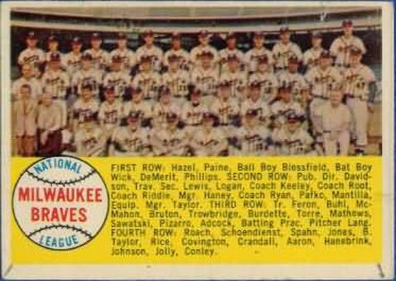
Team cards in this set are different from Topps' previous sets. The players' names are listed on the front, as in 1956, and the team name is shown inside a baseball-shaped graphic. A notable difference is shown with the team cards for the Giants and Dodgers. While the other 14 team cards feature city names, the other two are shown as "1957 Dodgers" and "1957 Giants." This reflects the fact that both teams moved west prior to the 1958 season. The main difference in the team cards is that the backs feature checklists; for the previous two years, Topps printed separate checklists. Four teams in the fourth series (Braves, Tigers, Orioles, and Redlegs) can be found with either alphabetical or numeric checklists.


Card #377 -- Milwaukee Braves Checklist

Speaking of variations, the 1958 Topps set is loaded with them. In addition to the checklist variations, there are 33 cards from 2-108 that feature either player or team names in yellow letters, instead of the more common white letter variation. Many of these variations feature Hall of Famers, including Hank Aaron, Roberto Clemente and Al Kaline. The checklist below explains which cards have variations. A scarce variation, and one that doesn't usually get listed in checklists, is card #433. Pancho Herrera's card can be found with or without the letter "a" at the end of his name. The correct variation is a common card, but the error is almost impossible to locate. Finally, when Topps triple printed the Musial and Mantle All-Star cards, they short printed four cards (443, 446, 450 and 462) to accommodate them, making those cards slightly scarcer.

There were also cards inserted into the packs for gum wrapper redemptions, suck as this one for felt team emblems:


Finally, here's an example of a five-cent pack from 1958:


Compared to Topps' other sets of the 1950s, this set is one of the easiest to complete, if you try to complete the basic 494 card set. Unlike most of Topps' early sets, there are no high-number scarce series. Instead, collectors find the first 100 cards to be the hardest to locate. Getting all of the yellow-letter and team variations is tougher but not impossible, but completing the set with the "Herrer" error is quite a challenge.

Wednesday, August 31, 2011

One-of-a-Kind "Updates"

As a team collector, I occasionally get a couple of items from other collectors that I wasn't expecting.

Back when the football sets Topps issued were a lot smaller (132-160 cards), there were fewer players available to include and usually didn't get the series treatment that baseball sets did. This -- along with the fact that it took an entire year for players to be shown with their new teams -- sometimes called for collectors to make their own "updates" as they needed.

Here's an example:

1958 Topps #2 -- Bobby Layne

Early in the 1958 NFL season, the Detroit Lions traded their quarterback Bobby Layne to Pittsburgh, which was then a perennial loser. That was likely a blow for a player who had just QB'd his team toward a championship (though Tobin Rote took over at the position late in the '57 season when Layne was injured). Since the cards showing Layne with the Steelers wouldn't arrive until 1959, that was a minor problem for a fan and his ballpoint pen.

As far as him still being in a Lions uniform, that wouldn't matter...since Topps showed him in a blue jersey in both 1959 and '60.

I'm guessing a Lions fan wrote this, based on the way he spelled the team name.

Then there's the player who was skipped over from having a card, like this Hall of Famer:

1970 Topps #3 -- Verlon Biggs

Joe Greene's rookie season was in 1969, and he immediately became an impact player. In 1970, he was an All-Pro player. However, he didn't get a card in the 1970 Topps set, due to the fact that few defensive linemen could get priority over quarterbacks, rushers, receivers and linebackers. That, and the little fact that the Steelers went 1-13 in '69.

Undaunted, a young fan took a card of a player who looked a little like Joe Greene, penned in his name...and team city...and corrected the position.

Fortunately, Joe Greene would never again be left out of a Topps set. Beginning in 1972, the company's football sets were expanded to allow a lot more players who weren't "impact" players.

Friday, December 24, 2010

Holiday Wishes

With Christmas Day coming tomorrow, I realize many of this blog's regular readers are busy with other things than stopping by to read what I've written. Actually, that's the way it should be. With family activities, traveling and holiday revelry, anybody who's stopping here in the midst of that to read what I have to say about cardboard pictures that were designed decades ago probably needs to take some time to get away from the computer. A paradox, I know.

Despite that, I'm glad you stopped by anyway. As for me, I'll be working today and tomorrow. Fortunately, my job starts after dark and I'll be getting time and a half for both days.That way, I can still visit with family and friends in addition to getting paid better for a couple of days. That sounds like a win/win to me.

However, since this is a time for giving gifts and you're stopping here anyway, let me pull out one of the oddball cards from my collection to show off today:

This card is from 1958. It was originally included as an insert in wax packages of regular Topps cards that year, along with a contest card related to the All-Star game. The cards were a way of adding something to packs after the checklists (issued as separate cards in 1956-'57) were incorporated into the regular set.

As the card says, all 16 teams were available as 5-inch felt logos, including the new cities for both the Giants and Dodgers, who had moved before the '58 season began. In order to get the logos, there was a process described on the back:

As you can see, this was a way for Topps to boost sales of its two main brands of bubblegum. There's even an explanation that Bazooka Joe comics and wax wrappers weren't part of the deal. There was also an explanation about adding a separate, stamped envelope to get it back, as well as an admonition not to send money.

As for the Topps address, I like the way it shows the way large cities used addresses before the ZIP code was introduced in the 1960s. Larger cities were divided into zones, and Topps' mailbox was in "zone" 32 for Brooklyn, which -- if I've read the history correctly -- would have become 11232 after the implementation of the ZIP code.

I picked this card up from a store in St. Augustine, Florida before it closed down for good. The owner wasn't sure what it was and let me pick it up for one dollar. A nice deal indeed.

Friday, October 22, 2010

Sloppiness at Topps...1959 Style!

About a month ago, I wrote a lengthy post here about the 1959 Topps set. At the end of that entry, a comment by faithful reader ecloy indicated that one of his favorite cards in the set is this one:

1959 Topps Card #447 - Bob Anderson


I'll share ecloy's comment here:

One of my favorite cards in this set features a Cubs pitcher, Bob Anderson. He has one of the "painted" black and white pics, but the photo doesn't extend to the bottom of the photo circle on the front! There is a fairly sizable black spot where the pic just cuts off!
Sure enough, not only do you see where the picture stops...but if you click on the image and show it as an enlarged picture, you can even see where the artist stopped painting the "off-white" color for his uniform. It almost looks like the Topps employee who set up the picture on this card decided on the perfect placement of Anderson's autograph and assumed the artist would fill in the rest.

The card was in my collection but had totally escaped my eye. However, here's something that didn't get missed once I looked at it...that wasn't the only mistake Topps made when they designed this card. Here's what the back looks like:


(If you click the picture, it'll show up larger if your eyesight ain't what it used to be...like mine).

It's a pretty standard Topps back. The minor league stats are shown, along with a partial season spent with the Cubs during '58. The '58 stats show up in the bottom line as Anderson's complete major league record. Unfortunately, somebody didn't bother to look at this card from the 1958 Topps set:

1958 Topps Card #209 - Bob Anderson

Yep, it's the same guy, with the same picture as 1959. This time, however, there's a full uniform that has been painted onto the original photo (which means it could have been used again for the '59 card as well. I mean, it had alredy been done!). But that's not why I'm showing this card here. Check out this back:


Anderson had pitched a few innings for Chicago in '57 as well. However, those stats didn't warrant any mention at all on his 1959 card. Topps kept records for all its players in a file cabinet, with photos and stats and records of catalog items they ordered in exchange for the money Topps was supposed to pay them for the right to use their picture. For all we know, they had locks of hair and baby pictures of all the players as well. With all the stuff on file, it's odd that they didn't bother to include all of a player's major league statistics -- especially for a player they had already included in their previous set -- on his card.

Anderson continued appearing in Topps sets through 1963. Somebody evidently pointed out the error, because when Topps went back to full-career stats on the back of their 1961 cards, the "missing" 1957 line had returned to his career numbers.

Thanks, ecloy, for giving me the idea for this entry.

Wednesday, October 13, 2010

The Word of the Day...

...is "unfortunate."

From time to time, I like to show off some cards from my collection that I love dearly but others would label "unfortunate."

This one applies to the picture on the card rather than the card itself:

Okay, there is evidence that a staple once went through the card and that's unfortunate, but that isn't what makes this card memorable.

The 1958 Topps design called for a solid-colored background. To achieve this effect, Topps needed to trim away all of the image around the player photo. While this made for some great-looking cards that popped from the background, sometimes it would have been helpful to leave a little more in the original image. Take poor Red Wilson above, whose picture looked like it showed him swinging his bat. Sadly, the bat was cropped out, which makes Red look a little like he lost part of his right his arm in an (ahem...) "unfortunate" combine accident.

"Unfortunate," indeed...

Wednesday, September 29, 2010

The "Dog Pound"

Monday's entry was about a set that was given to consumers who bought dog food...so today I figured I'd share a bunch of dog ears.

Back when I was beginning to get into collecting vintage material as a teenager, I was often forced by necessity to keep my expenses low. Back then, when I still lived in my parents' house and my hobby purchases were usually financed by the First National Bank of Mom, I usually opted to find low-cost material to add to my budding collection.

Fortunately for me, it was the 1980s and there were still dealers who had dime and quarter boxes on their tables that could get me some vintage material. While I knew I wasn't going to pull any key cards from those boxes, they allowed me to add more cards to my collection given my budget. For some reason, I seemed to get an awful lot of 1958 Topps cards from those boxes. In fact, at one time, my collection of 1958 Topps cards featured so many dog-eared cards I began referring to it as my "dog pound" set.

While many of those cards have been upgraded over the years, I still have some of those cards in my binder. For your entertainment, here are some of the ones I haven't put up for adoption yet:

Sherm's card looks as wrinkled as his shirt. I know he was known for being a durable catcher, but this card just looks worn out.

A player whose uniform number has been retired by the Yankees, the 1963 American League MVP, and the guy who finally displaced Yogi Berra from behind home plate? Definitely worth a quarter.

This guy looks like he's gone several rounds with Sugar Ray Robinson.


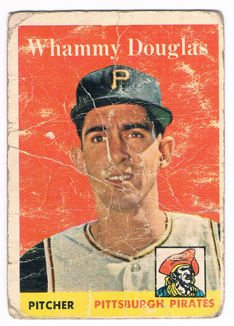
This card was worth it for the name alone. Those of us who remember the TV game show Press Your Luck might wonder whether this card managed to lodge itself into the deep subconsciousness of a 1950s kid and future TV executive who thought "Whammy" would be a great name for the gnome who pops up and takes away all of a contestant's winnings.

Finally, this was a card that wasn't picked up in a dime or quarter box but is holding a space in the binder for a future upgrade anyway. 1958 was the first year the Dodgers played in L.A. so the team players' cap logos are all airbrushed in this set (and the Giants players, too). While the Dodgers' caps look relatively clean, some of the Giants look terrible. I'll have to show them in a future post.

Friday, September 17, 2010

Q&A

Rob asks:

"I decided to look  through 1958 Topps cards online. I did an eBay search for a Stan Musial, and all that came  back was the all stat Stan Musial. Then I looked at my SCD book and saw no regular Musial.....My question is Why did Topps only print an All Star version of Stan Musial? Any help with this topic would be greatly appreciated."

(Another card with "character" from this blogger's collection)
A:

If you look at all the major baseball card issues, you'll see that Musial wasn't in anybody's set between 1953 and '58. '54 Red Heart was the sole exception. His '53 Bowman card in the color set was his final one for that company, and that '58 All Star was his first Topps card in all. Additionally, he had been left out of Bowman's 1950 and '51 sets as well.

I'm not really sure why he wasn't in any of those sets, though. A similar question to Net54 was answered with several theories. Perhaps he was under some type of arrangement with another company like Rawlings, or he may have ignored attempts to get him to sign a card contract. He may have felt the card companies weren't paying enough money to be bothered. Perhaps one of this blog's readers has some insight and will leave a comment.

Wednesday, June 30, 2010

Another Gem

There are several cards in my collection that have stories to tell. Here's one of them that I picked up while still in high school:

It was Summer 1989. Those who were part of the hobby then remember the way card shows popped up everywhere then. Even in small towns like the one I called home, there seemed to be at least one show within driving distance every weekend. In northern New York, I sometimes got to travel across the border and roam the tables in Ontario, Canada. For this show in '89, I went to an armory in Kingston, Ontario.

There are a few things I remember noticing from that show. First, for a kid who only lived 30 minutes from the border, listened to their radio stations and even picked up their TV stations, I was struck by how different everything was. The armory had a Canadian Army recruiter set up at a table, who was dressed differently from the U.S. Army sergeant I had been talking with at the time yet still said many of the same things. The stores had different names, all the signs and products were written in two languages, even the soda cans were made differently. The second thing I noticed was how many more O-Pee-Chee cards were available there. While I did understand that OPC was a Canadian card company, we didn't really see many of them just 30 miles south.You'd think more of them would have filtered their way across the border.

At one table, I saw this 1958 Topps card of Ted Williams. While it wasn't much condition-wise, what stopped me was the price tag: $7.50 Canadian, what was then the equivalent of about $5 in U.S. currency. The chance to grab a card from Teddy Ballgame's playing days was really tempting, but at the time I was still using the First National Bank of Mom and my purchases needed to be cleared through her. As she looked at the card, her first reaction was, "that's a really beat-up card for that much money."

The seller seized the opportunity. "Actually, Ma'am...if it were in top condition, it would be worth $375." He had watched me look through his cards. He saw the way I flipped through stuff but stopped at that Williams card and considered it for a while. Perhaps he'd used the technique before, but it made Mom do a double-take and pull out the money.

Twenty-one years later, it's still a part of my collection, even as I've upgraded several of the worse cards from my 1958 Topps set-in-progress. I don't know if it's because I've been unable to find a reasonably-priced Williams or if it's because the one I have is a reminder of a long-lost era. As the first card in my 1958 binder, it immediately takes me back to myself at 16 and a time where I could visit card shows all the time.

Thursday, April 22, 2010

Another Card From My Collection

As I'm adding to this blog, I'd like to share some of the gems I have sitting in my collection. While some bloggers will show you their top-condition, big-name star cards, I like to show off some of the cards that can tell stories. I guess I'm just different that way.

Here's one:

This card was evidently pulled out of a fire (look at that burn mark in the upper left corner). Someone was also kind enough to let us know exactly which team Mick played with. Sadly, the scan doesn't show the vertical crease in the card very well, or else I could toss out something about how it's no wonder that he was so often injured later on.