Showing posts with label football. Show all posts

Monday, September 10, 2012

A Different Type of "Scratch-Off" Card

The rookie card of James Brown is pretty well known in the hobby. Today, let's take a look at the back of the card instead:


Notice how there's a rather large are at the right with a trivia question, and that the answer can be seen when the area is rubbed with the edge of a coin. Here's a back where the answer is more visible:


Normally, the card that has been unscratched will sell for more than one that has been scratched, but this is a point that often gets overlooked by sellers who are content to just provide scans of the card's front. That can lead to some hard feelings when it gets sold to a collector who cares about condition and that collector flips it over.

Note to sellers: a scan of the back for all cards, not just the ones with scratch-off areas, might be helpful here. Collectors who are more condition-conscious will know beforehand whether the card has been scratched, and it'll help eliminate most of the returns that result. I know it's not many...but everything that staves off any headaches is a good thing in my opinion.

The scratch-off area has been with Topps football cards since before that. In fact, their football set in 1951 had a covered area on the back that could be scratched off:


The set's name -- Magic -- was a reflection of the fact that the colleges were obscured and that the owner was forced to look under the gray area to find out what it was. While many cards that have been scratched off look nice, the process of an 8-year old kid in 1951 using a penny or nickel to scratch the back didn't always lead to nice results. However, the scratch-off area doesn't seem to be as big a deal as one would think...unless the scratching left gouges in the card itself.

The process of having a trivia question with a scratch-off area was part of football cards (on and off) in both Topps and Philadelphia cards through 1970, but the gimmick has found its way into other sets as well: 


For instance, here's the back of a 1963-'64 Topps hockey card of Stan Mikita that features a bilingual question...


And a 1964 Topps card of Hank Aaron that reveals a question about a home run champ...though not about Aaron or anybody on his team.

Friday, February 3, 2012

Pre "Big Game" Post, Part 2

There are two reasons for the name of this entry. First(and I really wouldn't need to say this now, but this post will be readable for a long time to come), the Super Bowl is going on this weekend. Second...last year's post had a similar title and racked up a whole bunch of hits.

When it comes to football, I only collect one team, and they aren't taking the field for the title this year. So, I'll do a "history lesson" that doesn't need to include them.


But before I talk about this card, I need to stop and talk about where this image came from. It comes from a site called The Vintage Football Gallery, which really needs to be on your bookmark page if you're at all interested in vintage football cards. The owner of that site, Mike, is also the writer of Nearmint's Vintage Football Card Blog, which appears right here in my Blogroll.

This card is the only football player included in the 50-card Goodwin Champions set from 1888, also known as N162. The link in the previous sentence goes to my own site, as it is a general sports set that includes baseball players as well. It features Henry Beecher, the captain of the Yale football team and a relative of Harriet Beecher Stowe (she wrote Uncle Tom's Cabin just before the Civil War). It is regarded to be the very first football card in existence.

Class is dismissed. Enjoy the game.

Friday, December 16, 2011

Shiny, But Vintage

Once again, I'll celebrate the weekend by pulling something out of my Steelers collection:


This is a 1970 Topps Glossy card of Roy Jefferson. They shouldn't be confused with the larger-size Topps Super cards of the same year. These were inserted into the first series wax packs of 1970 Topps football cards, with 33 cards making up the complete set. They were printed on much thicker cardboard than the standard cards were and given a heavy gloss, which can be seen in the back scan:


Thanks to being printed on thick cardboard and getting a heavy coat of gloss, these cards are fairly easy to pick up in high grade today.

Monday, December 5, 2011

Snowy-Day Fun

Today, I'll feature this item from my Steelers collection:


It's a 1971 Topps Pin-Up and was inserted into wax packs of that year's football cards. While I usually have no problem with damaged cards, the two creases you see here are found on these, as they were folded twice to fit in the packs.

I will interject that there could have been a better color choice for the card than pink. I know Topps was a company that made its money selling bubblegum, but pink has little place in football. It's like crying in baseball.

Here's the back of the Pin-Up, which has a field and instructions for a football game:


If you right-click the image, you can read the rules and see how the game was meant to be played. I have a couple of questions, though: where the rules mention that the game is played with a "Ball Marker" (as it's called in the instructions), does that mean a game piece was also included in packs...or were the players simply encouraged to use something laying around, like a penny or a piece from the Monopoly game every house seemed to have? Also, I notice that the rules don't say anything about a clock.

One thing I do know...is that the rules mention using cards to determine game play. Those cards were also included in Topps wax packs during 1971:

They even used the same picture on both items for Russell. But longtime Topps fans know they were very good at recycling their images.

Monday, November 28, 2011

The "Leafs" Have Fallen...

For today's entry, I'd like to show off the 1948 Leaf football cards in my Steelers collection:

Card #2 -- Steve Suhey

1948 Leaf football was very similar in design to the company's baseball set that spanned the years 1948-'49. Leaf also issued football cards in 1949, but it was a different issue that contained players who also appeared in 1948. Fortunately a copyright date on the back makes it easy to tell which year the card was printed in case a checklist isn't handy:


The 1948 Leaf set features several college players as well as pros, which is a nod to the fact that the schools were often on a par with the NFL in those days. However, the 1949 set featured no college players at all, and the players who were still in school during the '48 set are shown with their pro teams in '49.

There were three Steelers included in the '48 set. Besides Suhey, there was this player:


This card shows the registration issues that plague the set (as well as the baseball set). In many cards, the colors don't align properly and in some case, they're skipped entirely.

The last Steelers player in the '48 Leaf set is Ray Evans, who was included in the high-number series. Though the high numbers aren't anywhere near as scarce as they are in the baseball set, they're still difficult. As a result, the Evans card is still on my wantlist.

For some odd reason, there were no Steelers at all in the 1949 set.

Monday, October 10, 2011

Evolution of a Football Design

For those who complain about how Topps basically recycles its baseball design for its football set later in the year, here's a post that explains it isn't a new concept. While I agree that it is a waste of a creative team to do so, it's merely a way of getting things done so a corporation can focus on making its money.

At the beginning of the post-World War II era, Bowman tried to get into the football card field. Whether its sets were quickly made or if there was only a limited window available, I have no idea.

As you can see from the scan:


Bowman simply used the same front design for its football set that was used in the baseball set earlier in the year.

One thing that was different was the back design:
(Click to see the pictures in a larger size)

Where the 1948 baseball set had only one ink color, two were used in the football set. It's a layout that would appear again in the '49 Bowman baseball set, as illustrated on the third card in the scan.

There was no Bowman football set in 1949, so we'll never know whether they would have used the same design featured in the last series of their baseball set that year (explained in this post from April). However, in 1950, they still went with the same format:


In 1950, both the baseball and football sets featured both horizontal and vertical orientations.I've included one of each type to show the difference.

This time, the backs were nearly identical:


Essentially, the word "Football" has been substituted for "Baseball." There are a couple of minor changes, but they're basically the same back. Without looking at the front picture, it would have been easy to get the two mixed up without a closer look.

In 1951, there was a better definition between the sets:


While the baseball set used a simple black strip with a name inside, the football cards swap the colors and add black lines to the top and bottom, and then place a team logo on the card. In my opinion, this was a very nice improvement. Had they used the logos on the baseball cards, Topps couldn't claim to be "innovators" for putting them on their 1952 cards. In any case, Bowman beat them by several months.

However, the backs were once again similar:


About the only format change involved the name of the sport in red ink.

Monday, September 19, 2011

Disappearing Act -- the Football Edition

There was one really lousy thing about collecting Topps football cards when I was a kid.

They didn't look right. The logos were airbrushed off the helmets, and when I was young I didn't understand why the players on the cards didn't look like they did when they played on TV.

Here's a card in my collection from 1968:


Andy Russell is posing helmetless, as most players of that era did. However, he's holding his "brain bucket" in his hands, and you can see the familiar logo.

In 1970, Topps lost its right to include NFL logos (including team logos) on its cards. It wasn't really noticed that year, as all the pictures used had players in positions without their headgear. In '71, only three cards needed to get the airbrush treatment; since none of the three were Steelers, I don't have one to show here.

In 1972, there was a subset of "Pro Action" cards and an increased commitment by Topps to show "game day" pictures...and they really stand out by how awful they are. And in the high-number set, here's one of the two Steelers:


It's Andy Russell again, but the helmet in his hands has an ominous shadow right where the logo should be. And he seems to be inadvertently giving "the finger" to Topps as an expression of disapproval.

There was one other thing that needed to be removed from some of the cards...


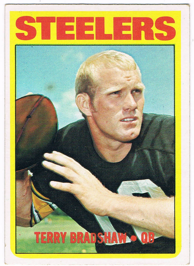
Take a closer look at the football in Terry Bradshaw's hand:


It's been airbrushed as well, in order to get the NFL logo off of the pigskin.

It would take until 1982 before the logos returned to Topps cards. It was a really long decade for football card collectors.

Wednesday, August 31, 2011

One-of-a-Kind "Updates"

As a team collector, I occasionally get a couple of items from other collectors that I wasn't expecting.

Back when the football sets Topps issued were a lot smaller (132-160 cards), there were fewer players available to include and usually didn't get the series treatment that baseball sets did. This -- along with the fact that it took an entire year for players to be shown with their new teams -- sometimes called for collectors to make their own "updates" as they needed.

Here's an example:

1958 Topps #2 -- Bobby Layne

Early in the 1958 NFL season, the Detroit Lions traded their quarterback Bobby Layne to Pittsburgh, which was then a perennial loser. That was likely a blow for a player who had just QB'd his team toward a championship (though Tobin Rote took over at the position late in the '57 season when Layne was injured). Since the cards showing Layne with the Steelers wouldn't arrive until 1959, that was a minor problem for a fan and his ballpoint pen.

As far as him still being in a Lions uniform, that wouldn't matter...since Topps showed him in a blue jersey in both 1959 and '60.

I'm guessing a Lions fan wrote this, based on the way he spelled the team name.

Then there's the player who was skipped over from having a card, like this Hall of Famer:

1970 Topps #3 -- Verlon Biggs

Joe Greene's rookie season was in 1969, and he immediately became an impact player. In 1970, he was an All-Pro player. However, he didn't get a card in the 1970 Topps set, due to the fact that few defensive linemen could get priority over quarterbacks, rushers, receivers and linebackers. That, and the little fact that the Steelers went 1-13 in '69.

Undaunted, a young fan took a card of a player who looked a little like Joe Greene, penned in his name...and team city...and corrected the position.

Fortunately, Joe Greene would never again be left out of a Topps set. Beginning in 1972, the company's football sets were expanded to allow a lot more players who weren't "impact" players.

Monday, August 15, 2011

Football is Returning...

With the ugliness of the NFL labor negotiations out of the way, the teams are once again beginning the preseason and will officially start the 2011 pro football season next month. With that, let's take a quick look at some football cards from the 1960s.

Topps had been making NFL football cards since 1956, when the company bought Bowman. Their string of NFL sets ran through 1963 (in '61, they issued a set with players in the AFL as well), but a backroom deal caused Topps to lose the rights to NFL players beginning in '64. Fortunately for Topps, Fleer was getting out of the sportscards business and the rights to the AFL kept them in the business of making football cards for the next four years.

During the next four seasons, the NFL players appeared on cards issued by the Philadelphia Gum Co., a maker whose previous sets included a 1948 set called Sport Thrills. For the most part, all four years featured a similar design, with some minor adjustments along the way.

1964 Philadelphia -- Jim Brown

I featured the Jim Brown card here to show the pink Cadillac that appeared on all of the Cleveland Browns' cards in 1964. There are hobby rumors stating that the car was Brown's, or that it was from a dealership that Brown owned, but others say the photos were simply taken near the Municipal Stadium parking lot.

To my eyes, the photo looks like Brown has been superimposed over the background, but I digress...

All other teams have regular (on-field) backgrounds. Otherwise, there is a solid-colored block with the player's name, team and position at the bottom of the card.

1965 Philadelphia -- Bart Starr

In 1965, the solid-colored block was still at the bottom with the same info, but this time an NFL logo was added to the card. The box was shortened to fit the logo.


1966 Philadelphia -- Gayle Sayers

In 1966, the box was placed at the top of the card, with the NFL logo placed inside.

1967 Philadelphia -- Johnny Unitas

For 1967, the NFL logo stayed at the top, but the solid-colored box (still resembling the 1964 format) was returned to the bottom of the card. The other main design change is a bright yellow border around the card.

Topps regained the right to NFL players for 1968 and issued sets with players from both leagues until the AFL/NFL merger in 1970. Ironically, that was the same time the company lost the rights to show helmet logos...but that's a topic for another entry in the future.

Monday, March 21, 2011

Recyling -- Topps Style

Last month, I showed how Topps used the same exact design for their football and hockey sets in 1966. There was no attempt to make a subtle change for the sake of collectors who pick up different types of cards so they could avoid getting Stan Mikita mixed up with Nick Buonticonti.

It turns out it wasn't the first time they did that.

That post I mentioned earlier got some feedback from a reader who goes by the handle 1967ers. Shortly after that post, he let me know about his blog, where he says he'll focus on hockey material. This post described the 1964-'65 Topps hockey set, which looked like this:

Card #3 -- Terry Harper, Montreal Canadiens

I immediately recognized the design because of another set:

Card #26 -- Wray Carlton, Buffalo Bills
(Image borrowed from the Virtual Card Collection)

It's the exact same design (and dimensions) Topps used for the 1965 football set. While the team name on the hockey cards are replaced by a city name, they still retain the curvature at the bottom. In addition, the corners are similarly rounded. While both of the cards shown above feature partial body shots and equipment, both sets feature an awful lot of head shots, which look really weird on such large-format cards.

There was a minor change to these cards. Here's the back of that hockey card:


Now look at the back of the football card:


A little more color was added to the cartoon on the back of the football card, a black bar was added to the area around the name, and the stats are in a different place. Oh yeah...the football card shows that it was made in the U.S.A. rather than in Canada. However, the formats are quite similar.

Friday, February 25, 2011

Players on the Tube

On Monday, I revisited an article I'd written several years ago. Today, I'll do it again.

In 2004, I wrote a newsletter article about the 1955 Bowman set and the then-new invention of color TV. The article appeared again in 2007 in the SMR magazine that PSA puts out. Click here to read it (in PDF format).

However, what many collectors don't realize is that the '55 Bowman set wasn't the first to use a television design. That honor goes to the 1950 Drake's set:

Card #22 -- Eddie Stanky

While many collectors remember Drake's for the cards they included on the packaging of their various snack boxes during the 1980s, in 1950 they were a smaller regional bakery and these cards were available in packages of oatmeal cookies or "Jumble" cookies. The cards aren't impossible to collect, but they weren't widely collected when they were new and the black borders make them tough in high condition.

For more about the 1950 Drake's set, here's a link to the set description in my main site.

After 1955, the TV-inspired design never went away. Topps would return to the concept in 1966, for both its football and hockey cards:


The football design used cherry-colored woodgrain, similar to the one used in the '55 Bowman set. However, they removed the "Color TV" faceplate and the knobs below the picture tube to place the player's name, team and position.


The used the exact same design for their hockey cards that year. I borrowed the image of this Mikita card; it very well may be an O-Pee-Chee, judging by the Canadian-styled spelling of "Centre." (Edited: the explanation appears in the Comments section.)

Too bad Topps didn't use the TV-design for its 1966 baseball set. The design they went with is often pointed out as one of the more unimaginative of the 1960s, and even a horizontal design may have been neat, since there hadn't been one of those since 1960.However, Topps didn't toss the TV out the window:


In fact, they used the design as part of the next two years' World Series recaps. That was a good use for the designs, since many fans watched the games on their own televisions.

They even revisited the concept a couple of years after that:


But of course, that was a TV show, so the design was perfectly suited for it.

Wednesday, February 2, 2011

Pre-"Big Game" Post

You may have heard there is a big football game being played this weekend. Long-time readers know I have an affinity for one of the teams that will be playing. However, as a fan of football the way it used to be played, the other team is also a team I appreciate due to their long-term history. Yes, I'm a Steelers fan. However, you'll never hear me trash-talking about it, as I prefer to let the team do its own talking on the field. As a fan of history...watching two teams with so much tradition go at it for all the marbles is just a great thing for the game. I just hope it's not a blowout either way; there's nothing worse than losing interest during the third quarter because the game's gotten out of hand.

So, this post will focus on something from my Steelers collection. That said, it'll still be written to inform collectors about a couple things they may never have realized.

But, before the football part...a little baseball card talk. In 1952 Bowman was definitely caught off guard by Topps and its baseball set. Therefore, they made the decision to enlarge the size of their cards for 1953 to (almost) match the larger size Topps used. Before making that decision, however, they decided to print their 1952 football set in the two sizes:

That's a great pose on this Jerry Shipkey card, one that is close to the image used for both his 1950 and '51 cards. He looks like he's giving a command to one of his blockers to open up a hole for him.

The card on the left is the same size as 1951 and '52 Bowman baseball cards. The card on the right is the same size as 1953-'55 Bowman baseball cards. Each of the 144 cards of Bowman's set was made in both sizes, with some scarce cards in the larger-sized set. Cards that are divisible by nine are tougher to come by, with the numbers 72 and 144 being the hardest.

In fact, one of the three cards I still need for my '52 Bowman Large Steelers set happens to be #72, featuring John Schweder. I don't expect to add that one for a while, but if I do, you'll see it here.

Although Topps wasn't intruding on their football license in 1952, Bowman added some extra cards to their set that weren't part of their previous sets. Several rookies were featured in their college uniforms -- and while Topps released college football sets in 1950 and '51, they wouldn't do another until 1955 -- and each team had its head coach included. This included mainstream cards for legendary coaches like George Halas, Paul Brown and Steve Owen.

The Steelers' head coach was taking over as the 1952 season began:


It was Joe Bach's second stint as the Pittsburgh coach, after leading the team (then called the Pirates) in 1935-'36. One of the members of the very first Notre Dame team to win the National Championship in 1924, he was a teammate of the vaunted "Four Horseman." The back of the card says more:


Bach played both offense and defense, which was common in those early days. However, one thing shows up on the card that shows how history was being made. It mentions that Bach was eliminating Pittsburgh's single-wing offensive formation in favor of the T-formation. The single-wing was developed by "Pop" Warner and involved the ball being thrown to the quarterback rather than snapped. It's a precursor to the modern "shotgun" formation but had the backs in different locations.

While this card mentions the "temporary" loss of the single-wing, the history books still show that the Steelers were the last team to use it, and that they abandoned it in 1952.

Monday, December 20, 2010

"Mini" Football

In only its second year after regaining its rights to print NFL cards, Topps released a football set in 1969 that featured a player photo against a brightly-colored background:

(Remember this photo...you'll be seeing it again)

The cards featured great full-bleed borders, but for some reason they gave Topps some trouble. When they came out with their second and final series, the cards were given white borders and some of the background colors were toned down:


By the way, it's funny to see Ken Kortas as a Steeler in the second series, since he played in Chicago during the 1969 season. By the time this card was distributed through wax packs, uniform #75 was being worn by a rookie named Joe Greene, who kept that number through his retirement after the 1981 season.

The 1969 Topps football cards came in packs that looked like this:


The pack mentions a "mini-card album." One of those is also a part of my Steelers collection:

Notice the team logo has no color in it and appears to have been drawn by a high school student. At the same time, the "game action" photo appears to have been airbrushed to remove the receiver's logo, yet the blurriness really doesn't obscure the Giant defender's helmet enough to mask his team's identity. That's Kyle Rote, in what appears to be an old picture. Each team had a different photo, but few actually showed the team featured in the booklet.

The back looks like this:

Again, the logo has no color and appears to be a slightly larger version of the one used on the front. There were 26 books, one for each team then playing in the NFL.

Inside, there were spots where small cards could be affixed:


The cards were also placed into wax packs along with the booklets, as a perforated sheet of four cards:

(Yep, the same Roy Jefferson photo shown above)

No, I didn't rip the Roy Jefferson card away, I just happen to have the card as a panel as well as singly. There were 66 panels (264 cards in all, with some players appearing in variations), and 19 players in the set who didn't also appear in the regular 1969 Topps set.